Tuesday, 3 January 2012, 11:19 AM
Petter Nilsson of Industridraperier makes a stylish newsletter and he has asked for some comments and a few tips.
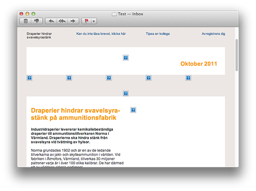
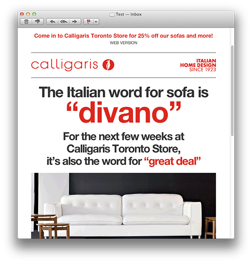
This is how it looks:
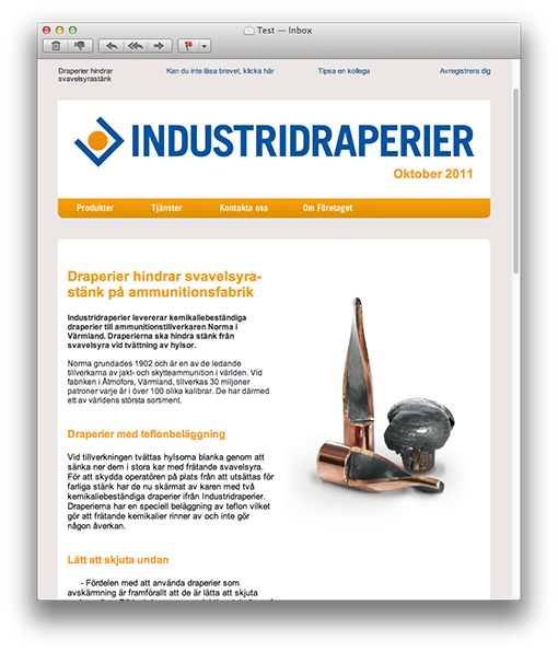
It’s simple, stripped and has a good-looking and coherent theme. Petter has really succeeded in his design of the newsletter, in my opinion.
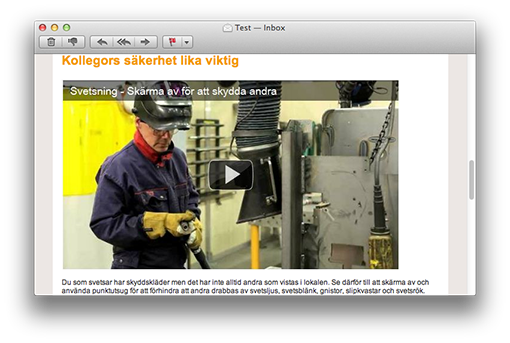
There’s also a film clip in this newsletter and my guess is that the clip gets more clicks than the text links. Generally film clips do get more clicks – at least when it’s clearly indicated that they are film clips. This is something that we increasingly use ourselves.
The film is in the form of a picture of the YouTube-player (that we all recognize) with a distinct play icon. Perfect!
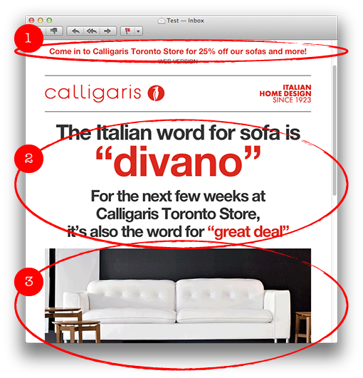
If I choose to open the newsletter in an iPhone, I must say that the text is somewhat small. Since I cannot read it I have to zoom in the parts I want to read. This is something you can solve in two simple ways.
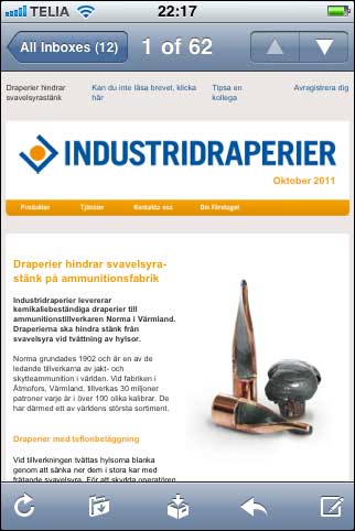
1. Reduce the width of the newsletter. At present the letter is in 660 pixels, but it could be 100 pixels more narrow to look better in a mobile e-mail reader, i.e. 560 pixels.
2. Use a bigger character size. The recommended minimum size in a newsletter is 12 pixels, which is the size of the characters in this newsletter. But it’s advisable to enlarge them to 13 or even 14 pixels.
Even better is a combination of the two suggestions and make the newsletter 560 pixels wide with characters of 13 pixels. Absolutely readable in a smartphone!
The headlines in this newsletter are big, clear, and short. Good! And you’ll find the unsubscription link both at the top and at the bottom – optimal!
There’s a preheader text at the top left side as a complement to the subject line and there is a balanced division between text and picture.
The dark blue text links are maybe a little difficult to spot in the middle of the black text. A suggestion is to move them further down and put them below the paragraph to the right instead.
One last thing: Alt-texts to the pictures. When the pictures are blocked you don’t get any idea of what they add to the newsletter:
Mainly this is a stylish newsletter and I choose not to comment on the content – because that’s something that Petter knows best!
Thank you Petter, for your contribution!
I give you three hearts!

Tuesday, 20 December 2011, 7:18 PM
When I shop online I want a certain amount of security concerning payments and delivery. I believe there are more people feeling like I do. One of my online orders was confirmed and I was told it was sent two weeks ago, but it hasn’t turned up yet! But now I got a link by e-mail so I could track the goods, which means that I now know it did move four days ago. Far from all e-retailers give their customers tracking links with their e-mail receipts.
CarpetVista in Malmö, selling carpets online, inform their customers in a good way, though.
Apart from the detailed product information on their site, their e-mail confirmations are good and confidence-inspiring.
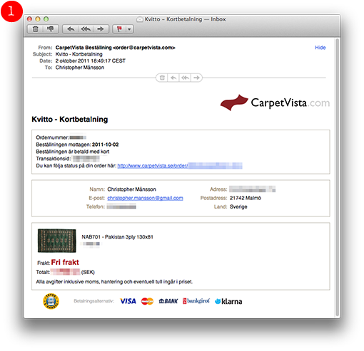
This is how they look:
As soon as I paid my carpet there was a detailed receipt in my inbox.
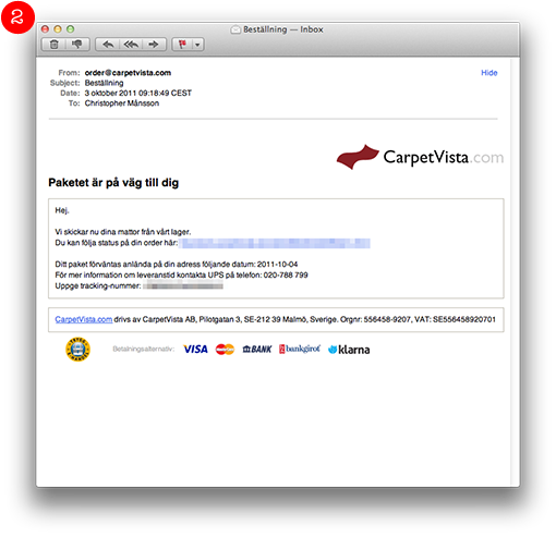
The day after they sent the carpet and I received another e-mail telling me that my carpet was on its way. Attached was a link so I could track my package.
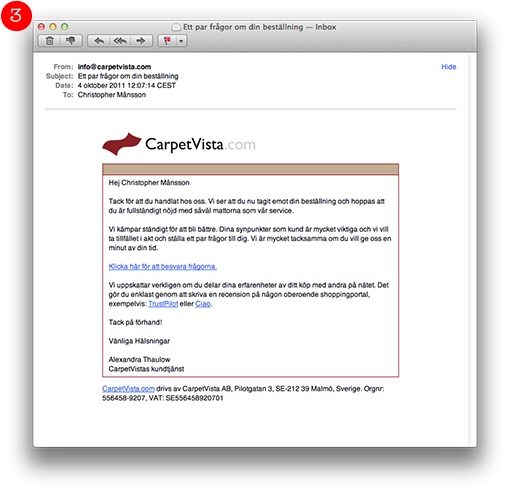
The following day UPS deliveed the carpet and the same day there was another e-mail with this piece of information:
Thanks for your order. You have now received your goods and we hope that you are perfectly satisfied with your carpets and with our service.
We constantly struggle to improve our customer service. Your points of view are extremely important to us and we would like to take the opportunity to ask a couple of questions. We would be very grateful if you would give us a few minutes of your time.
I think that the logistics of CarpetVista is very good and they make you aware of it by the use of e-mails. The buying process is secure and thorough.
Tuesday, 13 December 2011, 9:40 AM
I believe I’m talking on behalf of both myself and Sarah when I say that simple and clearly structured newsletters are the best. Sarah noticed this newsletter on Campaign Monitor’s site and thought it was a good example.
I like the way Calligaris keep the letter short and how they have divided it into clear sections.
1. The preheader, that is placed before the header in a mail, is more in focus directly in the inbox in modern e-mail clients. Calligaris give their preheader plenty of space since they let it run across the whole width of the newsletter. Why this is such a good thing you’ll see in the screen shots far below in this post.
2. The main content is graphically very spectacular and it almost looks like a picture, but it is in fact made as a text in various colors and sizes. This mail with a good balance between text and pictures easily passes through any spam filter.
3. The big picture is a gif animation shifting between two different pictures – a smart solution to keep the newsletter short – you don’t have to have several big pictures. Gif animations don’t work in some e-mail clients, but that doesn’t matter so much since the first picture in the animation always is visible anyhow.
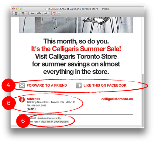
4. Clarifying links with texts and icons, in order to forward the letter or to like it on Facebook.
5. Address and a link with a map to the store is of course a kind of information the customers want.
6. A link to instant unsubscription – exactly how it should be.
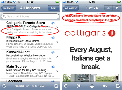
This is how the newsletter looks in an iPhone, and like I said, the preheader is exposed directly in the inbox.
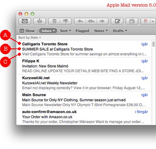
The same is true for a Mac, in the new Mail. Apple shows the preheader directly in the inbox. It’s possible to turn it off if you don’t like it, but now you can see not less than three parts with the standard settings in the e-mail client:
A. Name of the sender
B. Subject line
C. Preheader
To sum up: Think twice about how you use the preheader in your newsletters! More and more people can see it even before they open your e-mail.
This is a very well-made newsletter and I’ll give it four hearts.

Monday, 5 December 2011, 1:36 PM
Here’s another ingredient – one of the five that Sarah lectured on during the webbdagarna a couple of months ago. (You remember when she was talking about generation Y and e-mail marketing.)
Generation Y (people born between 1980 and 2003) is a very ”shop inclined” target group. If you give them a good offer in a newsletter, they won’t say no!
If you are an e-retailer, I recommend you to use the e-mails you already send to your customers. An e-mail receipt, a confirmation of order, the answer you send to a customer for ordering from your web shop – they’re all perfect for offerings and increased sales. If it’s not too complicated to add a link and a picture in your e-mail receipts this might be a good idea for a small e-retailer to try in December. Try out adding simpler things and measure what results they give.
Amazon, for instance, increase their sales by reminding their customers of gift cards in the e-mail receipts they send out.
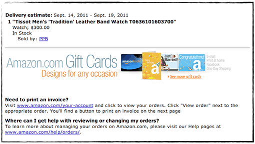
To do this they use an ordinary image link, which they then are able to trace to the e-mail receipt. The link has a little reference at the end telling that the visitor entered from an order confirmation e-mail.
This is how the link looks:
https://www.amazon.com/gp/gc/ref=gc_orderconfirm_email_hol
Tracing a click from an e-mail is usually not very advanced. So think about it!
E-retailers in Sweden don’t seem to use gift cards very much… Why?
Monday, 5 December 2011, 11:06 AM
A couple of months ago Sarah visited webbdagarna in Gothenburg and lectured about what the Y-generation finds enticing in e-mail marketing. Among other things she pointed out the ability of the Y-generation to absorb new technology. Right now it’s smart phones and tablets that’s eating the consumer’s market. These mobile units also have an impact on the market for e-mail clients and in what way we read our e-mails.
Ben Richardson, the founder of Campaign Monitor (an international e-mail service provider), has been generous enough to give us some current statistics for the Scandinavian market.
This is how it looks:

So the mobile e-mail clients cover as much as around 26 % of the Scandinavian market. This is a very high number and it continues to increase – rapidly. It’s also higher than the global number, which is around 18 %. You’ll find the global statistics and more details at Campaign Monitor’s web site.
Now when we know this you should consider how your newsletters look and what you can do to adjust them to mobile devices. Of course we’ll talk more about this at our blog.
Thank you, Ben Richardson, for the statistics!


