Thursday, 22 September 2011, 10:35 PM
Good ALT-texts!
Check out this newsletter! This is how it looks when the pictures are blocked:

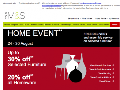
Notice that the menu at the top is designed as a text and not as a picture. I can tell you that this isn’t an easy thing to do. It has to match all the email clients and Macs and PC:s. The text must fit inside the frame of every button, regardless of what computer the recipient has. Awesome!
The ALT-texts – i.e. the texts that are visible when the pictures don’t show – are focused on what Mark’s & Spencer’s feel is most important. If a recipient has his/her pictures blocked they get the messages anyhow.
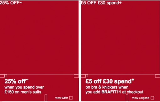
I especially like those small invitations: ”View Offer” or ”View Lingerie” a.s.o. So what M&S does is to encourage the reader to check out the pictures – and thus they increase sales. It’s pretty obvious when you see it, isn’t it?
This is how the newsletter looks when the pictures are there. The difference isn’t that huge, is it?
I would like to ask you a favor. I’m going to give some lectures this fall about emailing. Now the question: What would you find interesting to hear about? What content, what issues would you like to learn more about? I would be very happy indeed if you send me an email and tell me. sarah@iloveemail.se
Sarah@@@@@


