Wednesday, 31 August 2011, 10:13 PM
Fine Contrasts in a Margin Adjusted Newsletter
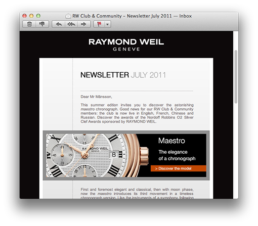
This newsletter from Raymond Weil – which I receive once a month – is a very simple, but stylish newsletter. I do like the design; it’s special enough despite the simplicity and the narrow format. The balance between text and picture is perfect and the contrasts are stark. They place the pictures in an unusual way and overlap the margin to the left. Really stylish!

Another fine detail – which you don’t really notice at first sight – add a lot to the design: The text is margin adjusted. The text paragraphs make square blocks since they form a straight line on both sides. This is something you usually do in printed matters and it doesn’t always work out so well on a computer screen. It often creates big apertures between the words – especially in Swedish where we often use long compounds. I – for one – would never use this technique for a Swedish webpage.
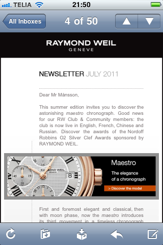
But in English it works much better and in this newsletter it looks really good. And it works equally good in an iPhone thanks to the narrow format of 500 pixels in width.

Raymond Weil’s newsletter has no problem with the spam filters and I’ll give it three hearts for a stylish letter and for fine watches. As for the rest, the content isn’t quite that interesting, I’m sorry to say.


