Sunday, 19 June 2011, 6:00 PM
A Gigantic Header
I just have to show you this newsletter.
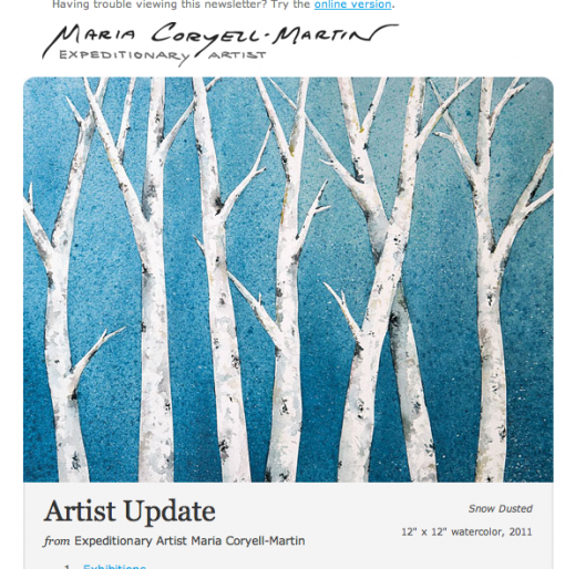
Every email designer would be terrified to see this big picture on top of the page. In this case though it seems to work – after all they have an opening frequency of 30 %. Evidently it works very well in a mobile phone too. Check what Campaign Monitor says about the letter here.
I felt I had to show you this since I so often claim that a big picture on top of the page isn’t the optimal choice. But sometimes the exception confirms the rule …
Sarah@@@@@


