Tuesday, 3 January 2012, 11:19 AM
A Newsletter from a Reader
Petter Nilsson of Industridraperier makes a stylish newsletter and he has asked for some comments and a few tips.
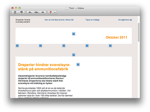
This is how it looks:
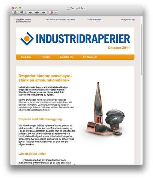
It’s simple, stripped and has a good-looking and coherent theme. Petter has really succeeded in his design of the newsletter, in my opinion.
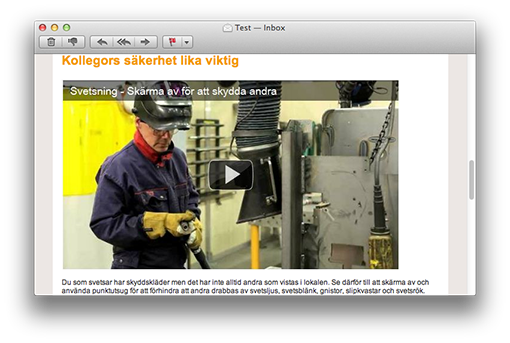
There’s also a film clip in this newsletter and my guess is that the clip gets more clicks than the text links. Generally film clips do get more clicks – at least when it’s clearly indicated that they are film clips. This is something that we increasingly use ourselves.
The film is in the form of a picture of the YouTube-player (that we all recognize) with a distinct play icon. Perfect!
If I choose to open the newsletter in an iPhone, I must say that the text is somewhat small. Since I cannot read it I have to zoom in the parts I want to read. This is something you can solve in two simple ways.
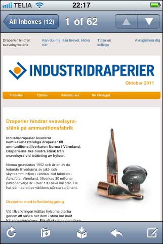
1. Reduce the width of the newsletter. At present the letter is in 660 pixels, but it could be 100 pixels more narrow to look better in a mobile e-mail reader, i.e. 560 pixels.
2. Use a bigger character size. The recommended minimum size in a newsletter is 12 pixels, which is the size of the characters in this newsletter. But it’s advisable to enlarge them to 13 or even 14 pixels.
Even better is a combination of the two suggestions and make the newsletter 560 pixels wide with characters of 13 pixels. Absolutely readable in a smartphone!
The headlines in this newsletter are big, clear, and short. Good! And you’ll find the unsubscription link both at the top and at the bottom – optimal!
There’s a preheader text at the top left side as a complement to the subject line and there is a balanced division between text and picture.
The dark blue text links are maybe a little difficult to spot in the middle of the black text. A suggestion is to move them further down and put them below the paragraph to the right instead.
One last thing: Alt-texts to the pictures. When the pictures are blocked you don’t get any idea of what they add to the newsletter:
Mainly this is a stylish newsletter and I choose not to comment on the content – because that’s something that Petter knows best!
Thank you Petter, for your contribution!
I give you three hearts!
![]()


