All posts in ‘Communication’
Thursday, 22 September 2011
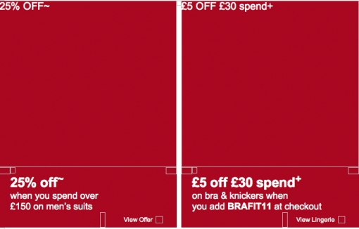
Check out this newsletter! This is how it looks when the pictures are blocked:

Notice that the menu at the top is designed as a text and not as a picture. I can tell you that this isn’t an easy thing to do. It has to match all the email clients and Macs and PC:s. The text must fit inside the frame of every button, regardless of what computer the recipient has. Awesome!
The ALT-texts – i.e. the texts that are visible when the pictures don’t show – are focused on what Mark’s & Spencer’s feel is most important. If a recipient has his/her pictures blocked they get the messages anyhow.

I especially like those small invitations: ”View Offer” or ”View Lingerie” a.s.o. So what M&S does is to encourage the reader to check out the pictures – and thus they increase sales. It’s pretty obvious when you see it, isn’t it?
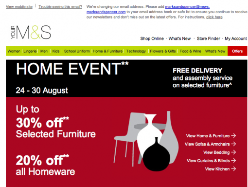
This is how the newsletter looks when the pictures are there. The difference isn’t that huge, is it?

I would like to ask you a favor. I’m going to give some lectures this fall about emailing. Now the question: What would you find interesting to hear about? What content, what issues would you like to learn more about? I would be very happy indeed if you send me an email and tell me. sarah@iloveemail.se
Sarah@@@@@
Wednesday, 14 September 2011
I’m in Boston at shop.org and I’m doing my best to listen to all the seminars. In general I guess you could say that we in Scandinavia are wrestling with the same problems as the Americans when it comes to email marketing. Most e-retailers don’t experience the same positive figures in opening frequency, clicks, and conversion as we did a few years ago. 95 % of the Americans have their pictures blocked – according to Ryan Urban at Acquisition. Social media seem to have gathered most of the attention here also – and email hasn’t really been regarded as a social medium, although it is really.
Stefan Tornquist started his presentation with a question about how many in the audience wanted to have ”Facebook likes” rather than their customers’ email addresses. I think the answer is pretty self-evident. Of course we prefer their email addresses. I liked that introduction very much; we didn’t have to waste any more time declaring the impending death of emailing. As you can understand the topic of the day is emails and for the very first time in months I think I heard some new things… Well, not that many new things, but still… 😉 Something that we’ve heard a lot here is that emailing is what drives conversion! Everybody really acclaims emailing here.
Here are some points I’ll bring home:
- The header or title of the newsletter should be shorter than we’ve said before. Not more than 30 letters, absolute maximum is 40 letters – blanks included. Quite a few e-mail clients cut off a text longer than approximately 40 letters.
- Convince your customers that your newsletter isn’t spam. You gain trust by using a well known sender name in combination with telling why you make this contact.
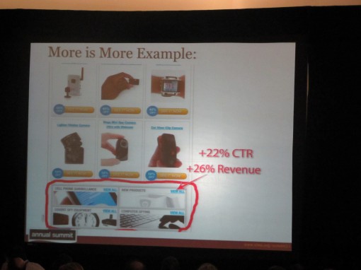
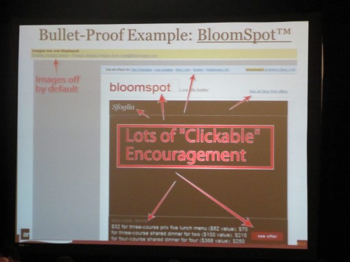
- Work with bottom navigation. Often you might send a newsletter containing products that aren’t interesting for all your customers, but maybe they want to visit your site to check on something else. So make it easier for them! Bottom navigation often results in an increased revenue. Do consider all navigation in your letters. Bloomspot is a good example to show that where there are pictures with Alt-text, the traffic is most intense.

- In A/B tests there havn’t been one single example showing that the longer letter looses in any way compared to shorter ones. Interesting, isn’t it? So, long letters are something you can use. But the readers behave as they were reading a list if the letters are long. They read the first parts and the last ones. Something to remember!
- When it comes to design and structure of a newsletter we often look at bigger companies. Don’t do that any more! Because the big companies are often the ones that handle blocked pictures in the least effective way. Amazon and Walmart don’t have Alt-texts that tell people to download the pictures, for instance. You should always add a link ”Check our offer” or ”Read the letter with pictures” in the mail itself in order to enhance the chances of the readers downloading the pictures. We looked at 3 examples: AppSumo, Bloomspot, and Groupon:


- One way of collecting email addresses is to use a neat pop-up window when the visitors are visiting for the very first time. Ask them for their email address and offer them something in return. In this way you can also send them: 1. An abandoned cart-email, 2. An abandoned site-email. See? The Americans know how to sell. 😉
- Follow the subscribers when on your site. Where did they leave? On the landing page? What can you do to make them buy? Email subscribers are generally spending more time on your site than ordinary traffic.
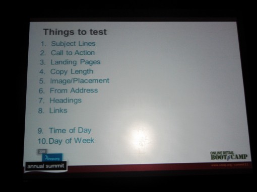
- Make tests of one thing at a time and do it in the right order. Here is an example of an order in which you can test various things:

This is a little sample of what we’re talking and hearing about here in Boston. Now I’m off to next seminar. (Just one more thing: I do like to be a princess again! Some time ago it wasn’t so cool to say that you were working with newsletters. The thing to be doing was about social media – then you were the princess. But see, now I’m back! How I love Boston!)
Tuesday, 13 September 2011
I promised you some time ago to look out for a few neat examples of unsubscribe buttons or links. Well, I have to admit that I almost regretted my overhasty words, because it wasn’t easy to find examples where someone had put a little effort into creating something new and classy.
Mostly the unsubscribe buttons are placed at the bottom of the letter and often in a very small font or in differing color. So, like I said: It was definitely difficult to find good examples of this particular function. Look at these:

Can you read the text about unsubscribing? It’s hardly visible! To me this is incomprehensible! Why on earth do you want to hide it if you’ve taken care of all the e-mail addresses in a correct manner? Do the customers buy more from you just because they don’t find the button? Of course not! No, they are annoyed every time they receive your newsletter and they probably regard your company as being a non-serious business.

The same goes for this one: A text that’s hardly visible at the very bottom.

The solution above seems to be increasingly common. They tell the recipients why they get the newsletter and then they tell about the possibility to unsubscribe at once. This is how a serious company acts. They want to give their customers control and security.

I have a soft spot for combining the unsubscribe link with the ”Contact us” information – and also with other necessary links. Above you see an example of this – although I feel that the text is a bit too much. But I’m still convinced that the readers quickly will find the unsubscribe button since it’s so close to other important information.
Now – here are two really, really good examples:

Would you dare to put the link in the preheader? This is truly very well done and I’m convinced that they don’t have that many unsubscribing readers thanks to the position of this button.

In this case the unsubscribe button is placed after the web-based version, but still in the perheader. Yes, they’ve given the reader control!
Now I’ll show you the best one!

And I’m so happy that the best example I succeeded to find is – in fact – Swedish and from Malmö! My sister sent me this newsletter and we agreed on the beauty and simplicity of it. The location of the ”Avregistreringsknappen” (the Unsubscribe button) is great; it’s in the midst of other important buttons. It’s also expressed as a picture à la ”app-thinking” and in text to be as clear as possible. There’s just one minor negative: I couldn’t see any alt-texts in my Mac mail since the pictures were blocked. But apart from that I make a princess curtsy for the Malmö Opera today.
If you have any other examples – good or bad – please share them with us all on our Facebook page! Or do ask us what we think about your unsubscribe button. Maybe, just maybe, it’ll result in more registrations. 😉
Sarah@@@@@
Saturday, 27 August 2011
Confirmation is not an easy thing. I mean, what can you send back to the customer more than a confirmation? Is there anything else you CAN send? If so – what and when?
Many ready-made web shop solutions don’t seem to offer possibilities to adjust receipts. No, you have to go in and write codes and build it yourself. If you have the opportunity to get some help from your e-mail service provider it’s a good idea to accept it. Too simple receipts with limited possibilities to apply additional value or extra information about the order can really bring down the shopping experience for the customers.
But with Amazon the customer can feel safe. If you once created an account and placed an order with Amazon you can be prepared for an easy buying experience. Their receipts are detailed and you always know what you get. Sometimes though they can’t send a certain product from the UK to Sweden, which means that you have to visit another web shop – maybe one you’ve never visited before, and one that isn’t Swedish. In that case it’s extra important that you feel secure.
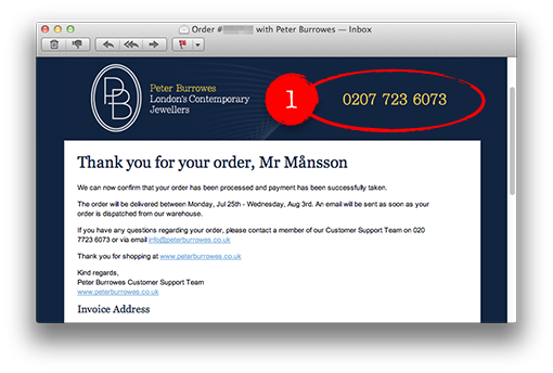
Here are my latest mail receipts. I chose a shop in random, since Amazon couldn’t deliver what I wanted. It happened to be Peter Burrowes in London.
There are mainly three things about Peter Burrowes’ mail receipts that I like.

1. It’s very clear how to get in touch with them. The telephone number is placed in the header, big and clearly visible. It sticks out more than anything else in the e-mail. Nevertheless, they even repeat it in the text, in case I missed it.

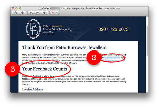
2. Very soon I get another e-mail telling me that they’ve now sent my order and they give me a tracking number in a ready-made link, which I just click on to get more information about where my parcel is right now. I don’t have to cut and paste information from the e-mail to the tracking page.
3. They encourage me to mark my ordering. My view point is appreciated, regardless if it’s negative or positive. They offer a reduction of 5% with my next order if I tell them what I think about my shopping. This is a really creative way of increasing the number of customer comments. They are probably well aware of the fact that all types of customer commentaries will increase sales – also the negative ones.
My buying experience was good. It was very simple to order and I didn’t have to register an account. The delivery was very quick indeed. London – Malmö in two days is impressive.
Tuesday, 23 August 2011
I’m so delighted to have the opportunity to work on an e-mail project for a somewhat younger target group. Hopefully I’ll be able to tell you more about it soon. The company in question has a really humble approach towards the e-mail channel and is prepared to change and improve things to reach their goals in this regard. I feel so privileged to be a small part of all this. Well, I wanted to learn more about their target group so off I went to the Stapelbäddsparken, a great place for young skate boarders in Malmö. I felt a bit shaky when I approached these young skaters to ask them what kind of newsletter they want to read. And I was sooo astonished! Apart from being very compliant and happy that someone was interested in their point of view they delivered some surprising answers. Here are some of the questions and their answers:
Q: What about the content in a good newsletter?
A: Should be about new things, the latest, sale – all in cool pictures and we would like to see the products from various angles. Clothes for instance, should be worn by a skater when skating. Show pictures on Flickr! More information about skating competitions, tests of new boards, shoes a.s.o.
Q: Do you shop via e-mail?
A: YES! If we get an e-mail when we’re skating together, then we might check and shop together and order things. And we’re so happy that some American sites finally agree on sending products to us in Sweden. But we don’t want to wait too long for our things to get here, though.
Q: How do you feel about a company sending frequent e-mails wanting you to buy form them?
A: No problem, everybody has to make money. If it’s a good deal we gain from it – and so do they. That’s okay.
Q: How is a trustworthy company in your eyes?
A: They’re on our side and consider us as being a part of the society! We want a better status!
To sum up: While we in the ”older” generations talk about not wanting to shop from foreign parties via e-mails, the younger generation says: ”Yes, of course we will!” Youngsters don’t mind e-retailers selling via newsletters providing they offer good things and reasonable prices. That’s interesting! What did I learn? We can’t presuppose that we know what our costumers want. We have to ask them! Apparently newsletters will prevail also in the future generation! If they’re written as the customers want them, that is …
Here are some pictures of the kids I interviewed:


Page 3 of 7«12345...»Last »

