All posts in ‘Communication’
Monday, 16 May 2011
Most of us, during our many online shopping sprees, have abandoned a cart or two before; but that doesn’t mean we didn’t want to buy those goodies – we probably did. Maybe it was the shrieking kids, or the phone ringing for that meeting you forgot about; nonetheless, these are the things that interrupt the online shopping experience. Upon abandoning that cart, all is lost and must be filled up again. But why? Don’t they save all that information in their system anyway? Yes, they do actually…
Imagine getting an email with that abandoned cart’s items in it, and imagine a link that brought you to where you left off; think of how many of us would gladly click “checkout”!
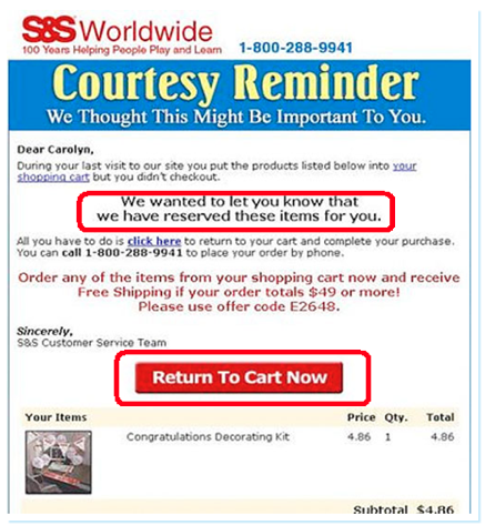
S&S has a 25% conversion rate for the where-you-left-off email, and 33% of their revenue comes from the abandoned cart (or reactivation) email. Marinate on that.

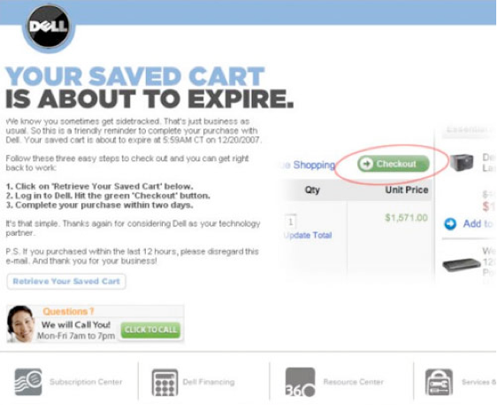
Dell is another good example. For their abandoned cart emails, they present everything very simply – a single click to checkout. What if images are blocked? What do you see then? Something to consider…pesky image blocking.

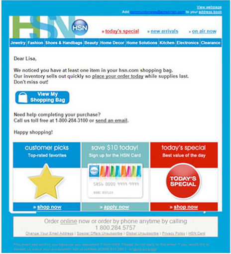
This next example is excellent! There are far too many e-tailers hiding their customer service phone numbers. So many things can go wrong to bring the transaction to a halt, naturally you want someone to call when it happens. If there’s no one to call, you don’t buy. Below, with HSN, help is at your fingertips – with an email or a phone number to call.

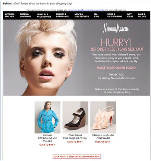
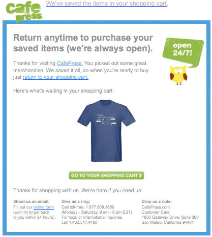
In this example, the customer can even see pictures of the items they added to their shopping cart, but never bought.

Below they’re using the pre-header to inform you that the shopping cart has been saved.

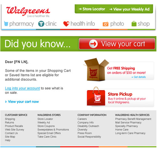
This email from Walgreens is a great example, especially in the design department – it’s crispy and simple. They’ve tried to make it a tad more personal, which is never a bad idea. But I have a bone to pick, there are too many things competing for your attention – “Free Shipping on 50$+ orders?!”, “What’s store pickup?!”…you see?

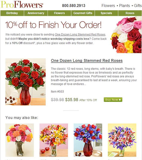
ProFlowers offers a 10% discount if you finish checking out. But then you run the risk of customers abusing that system.

So what exactly needs to be in an abandoned cart email? I’ve put a list together of the essentials below. Try to wiggle these into your email strategy.
- Title – the title of the abandoned cart email must be clear, and it must explain that it’s about the items the customer has abandoned in the cart.
- Avoid sales content. Have customer oriented content that helps the customer continue with the transaction – no exploding neon price signs.
- Include contact information – telephone and email.
- Use the customer’s name, and if possible, show the articles in the shopping cart with current pricing etc.
- Create a link directly to the cart.
- Give an expiration date for their saved cart – if applicable.
- Give the customer extra information about the items in the cart – links to a related video or recommendations from other customers etc.
- Avoid too much information. The customer should be able to navigate easily.
- Explain why your customer is getting this email and include an opt-out link if you plan to run a series of emails like this.
- Give your customers more information about the advantages of your items.
- Make links to tips, guides or inspirational videos.
- Give the customer an extra treat: a coupon, discount, free shipping, gift wrap…you get it.
- Give the customer suggestions for similar products, they might suit the customer even better.
- Ask the customers for feedback to improve the buying process.
- Give references to similar purchases.
Sarah@@@@@
Monday, 9 May 2011
It’s no secret that the travel industry is struggling with email marketing. Their opening frequency is in the dumps compared with other businesses – like certain organizations and B2B. But why?
Obviously there are many factors involved, but let me ask you – how many times a year is your average Joe doing concrete planning for traveling? Joe is limited to once or twice a year by time and money – naturally he’s not too interested in that travel email. If you remember the early days of email, you’ll remember that the travel industry was early in using email marketing – hence why people may be a tad fatigued over travel newsletters. These are just two of the many factors.
Travel newsletters nag way too much about prices, at least that’s what I see when I fumble through the letters we get. We’d be more interested in reading their letters if they focused on destinations – things to do, things to see, some inspiration. I found this the other day. It’s a blog – Flygstolen.se – and a very interesting one at that. Even if I’m not planning to travel now, I can get ideas about the future.

The blog talks to all of us. Which cities are excellent for photography? Should I rent a car in this city? There are articles about great airlines, beautiful hotels, and others services. They do have some offers in the blog itself, but they are definitely not the focus. How about this? Translate this idea into your newsletter and web content. I guarantee you will see a shift in your figures…
Sarah@@@@@
Tuesday, 12 April 2011
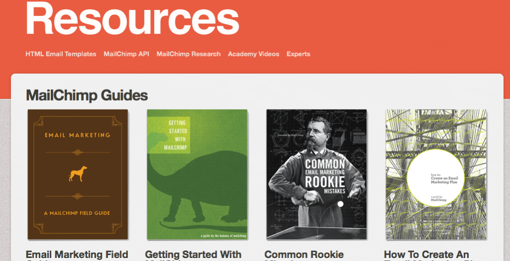
It’s no secret that Christopher and I like MailChimp, and especially the way they market themselves. Back in the day, when Christopher and I worked for the same email provider, we dreamed of writing small manuals and how-to’s for the customers — the purpose being that they have the power of knowledge to choose the parts of the tool that they would like to use. MailChimp has robbed and stolen that dream from us. They’ve created 20 brilliant, attractive, and useful little manuals — holding your hand from the email A’s to Z’s. We salute you, MailChimp! Good work.

Oh, and it’s all free! Download them here!
Tuesday, 5 April 2011
Consider these points:
- Map out what kinds of emails or newsletters you will be sending
- Meet your support or contact person
- Will they help you meet your goal and vision?
Choose the right email provider (PDF)
First point – Map the different types of emails you will be using, and make sure this email provider can help you with all of these different emails (confirmation, tip-a-friend-about-a-service, and product emails etc). The price could be severely affected by what they do or do not include.
Second point – Insist on meeting the person who will be taking care of you; and we don’t mean the sales person. Upon meeting this person, you can now answer the third point. It should be obvious by now if they understand where you want to go with email marketing. Are they going to help you meet your goals? Are they enthusiastic about your vision, or are they doing it just for the dough?
Fourth point – Integration: Don’t settle for just an open API. Don’t misunderstand me, an open API is all fine and dandy, but how much will they help you in using it? Does it cost extra? And if it does, how much will this limit you?
Last point – Take a peek at their policy. Everyone will tell you that they don’t work with bought addresses – bought shmought. But ask them if you can send messages to your bought addresses – ”You sure can!” Not a good policy, sorry… they’re spammers.
When you want to renegotiate – or when you are about to buy a tool for the first time – click on the link above and download our PDF outline. Sit down and prepare yourself before you interview your next provider. The PDF is in Swedish, however, English is on it’s way. But in the meantime, you can exercise your Google Translate skills. Copy and paste, here you come!
Sarah@@@@@
Wednesday, 30 March 2011
 Posterous – if you haven’t heard of Posterous, you’re missing out on a great thing; especially if you have a blog or use Facebook and Twitter.
The brains behind Posterous were fatigued by constantly logging in and out of Facebook, Twitter, and the multiple different blog services – when all they wanted was to share something: a blog post, a picture, a video clip.
They dreamt of a world where achieving this is as easy as sending an email – and we are now living in that dreamworld, it’s called Posterous.
Seriously, it’s almost too good to be true. It’s as simple as composing an email, pushing send, and it landing wherever you want it to land – in your blog, Facebook, or Twitter.
An example:
Posterous identifies you with your email address, which means that it will post to your corresponding blog, Facebook, or Twitter account.
Email, you still have a place in our hearts, and you can teach a 40 year old dog new tricks – thanks Posterous!
Go try it out and let us know what you think!
Posterous.com
Page 5 of 7« First«...34567»
