Monday, 18 July 2011

Here’s a little hint for all those who are coding manually in HTML. There’s a basic template you can start from here. It will certainly solve the most common problems you’ll come across; and in the most common email clients too.
htmlemailboilerplate.com

By Christopher Mansson
Category: Design
Monday, 11 July 2011
To complete our last post about the registration process of a newsletter – here’s how to build the unsubscription process. And we work with the idea of ”just one click”.
The process consists of three steps:
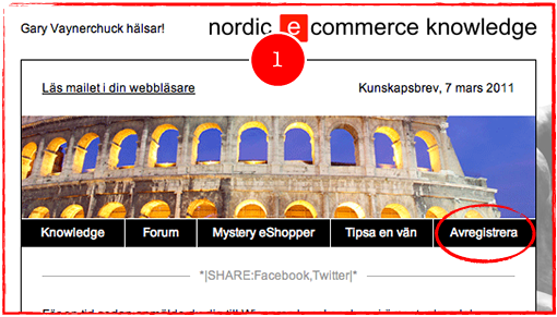
- An unsubscribe button in the email
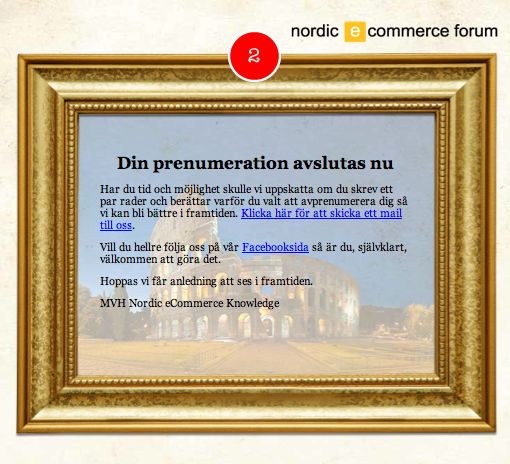
- A landing page that confirms the unsubscription
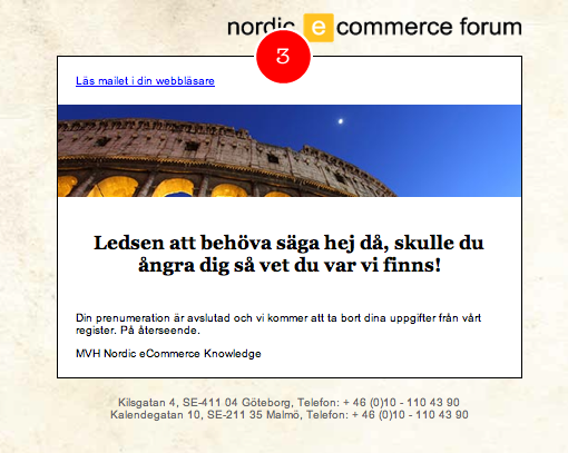
- A good bye email
In the letter there is a button, clear and obvious. A click – and it’s done! To unsubscribe should be as simple as this.

A landing page tells you that you are off the list and that you are very welcome to follow us on Facebook instead, if that is what you prefer.

A letter to say good bye is also something to consider – to give you a bad conscience … But also to tell you that your data are deleted from our list.


By Christopher Mansson
Category: Design
Monday, 11 July 2011
Earlier I wrote a post in three parts about how to get more subscribers to your homepage.
You’ll find them here:
Part 1/3 – Evaluate Present Registration Process
Part 2/3 – Simplify the Registration Process
Part 3/3 – Optimize the Registration Process
There were some positive emails and comments after these posts from people who wanted to test my suggestions – and some of them seem to have had the same good results as we did. Really nice!
But is there a lot of work behind a registration process with what you call a double opt-in?
Well, Sarah and me constructed a box for registration some time ago. The number of steps can vary, but most often they are five – three HTML-pages and two emails.
You could however cut the number of steps down to three – I’ll explain how a little later – but this time we chose the longer run – five steps:
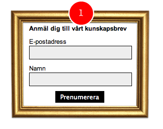
- Registration form
- Landing page after registration
- Confirmation email with a link for confirmation
- Landing page after confirmation
- Email to say welcome
What kind of extra information and on what page – it’s up to you to decide. Make some tests and consider the flow thoroughly.
This is how our process was in all five steps:
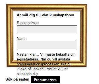
The registration form was put in a simple golden frame which sticks out on the page.

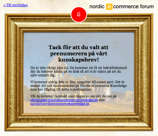
The landing page after registration also had a golden frame to stress the uniformity. We also tell the readers that they have to click on the link in the confirmation email we’ll send. We also inform about the fact that the readers’ data will be securely kept within the company, where only two people have access to the data.

In the confirmation email with a link for confirmation we chose not to distract the recipients with any other information. The only thing we want here is a click.

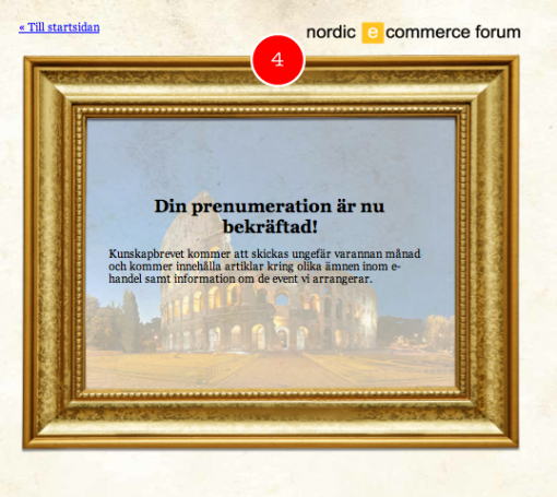
On the landing page after confirmation we chose to tell the recipients how often the newsletters will be sent. Of course we could inform about this before the registration, but we chose to spread the messages a little – so that people will take time to read everything.

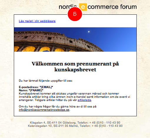
In the welcoming email we confirm the data the subscriber has given out and we remind him/her about our articles in our forum. We also encourage the subscribers to get in touch with us if they have any questions.

So, this is how it looks! You might feel that there are too many steps, but sometimes it’s necessary to make the subscribers feel comfortable. It is – after all – a subscription, even if it’s for free. Try to avoid subscription processes where your subscribers are asked to fill in their email address only – and then there’s nothing more.
If you’re going out for this – be sure to have a nerd at your side! Several email tools provide you with standard pages for registration forms, but if you want this to be accommodated to your home page – well, then it’s an HTML-code that needs to be written. Five pages of HTML-codes in this case. Three web pages and two HTML-emails.
It’s possible to shorten the process and make it in three steps if you choose to skip the landing page after registration and the welcoming email. But then you need to consider how to design the messages turning up on the page at registration. If the registration box is small you might want it to be ”taller” if the messages show directly in it.
An example: Before Sarah and me activated a separate landing page we got this result:

There are – of course – also a unregistration process that in a sense belongs to the registration process. But this demands – fortunately – fewer steps. I’ll show you later!

By Christopher Mansson
Category: Design
Sunday, 19 June 2011
I just have to show you this newsletter.

Every email designer would be terrified to see this big picture on top of the page. In this case though it seems to work – after all they have an opening frequency of 30 %. Evidently it works very well in a mobile phone too. Check what Campaign Monitor says about the letter here.
I felt I had to show you this since I so often claim that a big picture on top of the page isn’t the optimal choice. But sometimes the exception confirms the rule …
Sarah@@@@@

By Sarah Wittbom
Category: Design
Tuesday, 7 June 2011
I’ve always stressed that welcoming emails have to be extremely well thought out. The first impression is indeed an important one, but if it’s not a good impression, it will be the last impression. We don’t want our customers questioning why they ever signed up for that email in their inbox.
Let’s take a look at what happens when I first register for Innocents newsletter. Carefree, happy words of joy are sprinkled throughout this lovely welcome – assisting my mind in forgetting the fact that I’m sharing all kinds of personal information with them, including my preferred flavor of chewing gum. I smiled and told them what they wanted to know.
I also chose how often I wanted the newsletter. Have a look for yourself below:

Here’s something else to digest, saying “thank you”. It’s a lot better than: “You are now a subscriber to our newsletter.” Or even worse: “You’ve now been added to our list of subscribers.” As a customer, I don’t want to hear that I’ve just been “added” to a “list of subscribers”. I want to feel like an individual.

Facebook, Twitter, and blog integration are always major brownie points.
Nice work, Innocent! When you start offering spirulina juice I’ll become your most faithful customer!
Sarah@@@@@


