All posts in ‘E-mail Marketing’
Monday, 5 December 2011
Here’s another ingredient – one of the five that Sarah lectured on during the webbdagarna a couple of months ago. (You remember when she was talking about generation Y and e-mail marketing.)
Generation Y (people born between 1980 and 2003) is a very ”shop inclined” target group. If you give them a good offer in a newsletter, they won’t say no!
If you are an e-retailer, I recommend you to use the e-mails you already send to your customers. An e-mail receipt, a confirmation of order, the answer you send to a customer for ordering from your web shop – they’re all perfect for offerings and increased sales. If it’s not too complicated to add a link and a picture in your e-mail receipts this might be a good idea for a small e-retailer to try in December. Try out adding simpler things and measure what results they give.
Amazon, for instance, increase their sales by reminding their customers of gift cards in the e-mail receipts they send out.
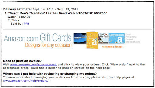
To do this they use an ordinary image link, which they then are able to trace to the e-mail receipt. The link has a little reference at the end telling that the visitor entered from an order confirmation e-mail.
This is how the link looks:
https://www.amazon.com/gp/gc/ref=gc_orderconfirm_email_hol
Tracing a click from an e-mail is usually not very advanced. So think about it!
E-retailers in Sweden don’t seem to use gift cards very much… Why?
Monday, 5 December 2011
A couple of months ago Sarah visited webbdagarna in Gothenburg and lectured about what the Y-generation finds enticing in e-mail marketing. Among other things she pointed out the ability of the Y-generation to absorb new technology. Right now it’s smart phones and tablets that’s eating the consumer’s market. These mobile units also have an impact on the market for e-mail clients and in what way we read our e-mails.
Ben Richardson, the founder of Campaign Monitor (an international e-mail service provider), has been generous enough to give us some current statistics for the Scandinavian market.
This is how it looks:

So the mobile e-mail clients cover as much as around 26 % of the Scandinavian market. This is a very high number and it continues to increase – rapidly. It’s also higher than the global number, which is around 18 %. You’ll find the global statistics and more details at Campaign Monitor’s web site.
Now when we know this you should consider how your newsletters look and what you can do to adjust them to mobile devices. Of course we’ll talk more about this at our blog.
Thank you, Ben Richardson, for the statistics!
Sunday, 13 November 2011
I recently wrote a blog post at I love e-commerce about a web shop’s bottom navigation. In almost all the examples I show the registration for a newsletter is placed at the bottom of the page. During all the years I’ve worked with e-mailing I have claimed that it’s best to put the registration button at the top of the page… But I’m not so sure any more, especially when it comes to e-commerce sites. Lena, my colleague, who is also the Mystery eShopper expert – she is testing e-commerce sites by acting like an ordinary customer – has shown me how important it can be to put valuable information at the bottom of the page.
Consider for a moment where you look for information that doesn’t belong to the actual product categories in a web shop. When you want to find information about customer service, share on Facebook, check in what city the company is situated – where do you look? That’s right, often at the bottom of the page. That’s why it’s a pretty good idea to put ”Sign up for our newsletter” right there.
Check this example:

It’s clear and neat. An icon and a button show what it’s all about. The design is fine without being overmuch.

This one is really spiffy, although the colors are quite dark which makes it a little difficult to find the register button. It’s placed at the bottom together with the categories.
Considering the footer itself I would recommend you to place the contact information as well as the categories there. If a great deal of the ”clicks” are there it might indicate that you haven’t given the kind of information the customers want and/or that they want some more information. So the statistics of the ”clicks” can help you making this right. If the majority of your customers click in the end of the newsletter for a certain category it might show that you should write more about that particular thing in the following newsletters. Here’s an example:

Below is an example of a footer from a restaurant showing where they’ve chosen to put information about opening hours and bookings. In addition they tell you about telephone number and the possibility to follow them on Twitter. It’s a good and informative newsletter where they also clearly tell the customers how much their meals are… Where do you think the customers look for the booking information? Of course, at the bottom of the newsletter.

Check your statistics! Isn’t it true that the fewest clicks are NOT at the bottom of the newsletters? And yet we often continue to put the least interesting information at the bottom…
Good luck with your ”feet”!
Sarah@@@@@
Wednesday, 14 September 2011
I’m in Boston at shop.org and I’m doing my best to listen to all the seminars. In general I guess you could say that we in Scandinavia are wrestling with the same problems as the Americans when it comes to email marketing. Most e-retailers don’t experience the same positive figures in opening frequency, clicks, and conversion as we did a few years ago. 95 % of the Americans have their pictures blocked – according to Ryan Urban at Acquisition. Social media seem to have gathered most of the attention here also – and email hasn’t really been regarded as a social medium, although it is really.
Stefan Tornquist started his presentation with a question about how many in the audience wanted to have ”Facebook likes” rather than their customers’ email addresses. I think the answer is pretty self-evident. Of course we prefer their email addresses. I liked that introduction very much; we didn’t have to waste any more time declaring the impending death of emailing. As you can understand the topic of the day is emails and for the very first time in months I think I heard some new things… Well, not that many new things, but still… 😉 Something that we’ve heard a lot here is that emailing is what drives conversion! Everybody really acclaims emailing here.
Here are some points I’ll bring home:
- The header or title of the newsletter should be shorter than we’ve said before. Not more than 30 letters, absolute maximum is 40 letters – blanks included. Quite a few e-mail clients cut off a text longer than approximately 40 letters.
- Convince your customers that your newsletter isn’t spam. You gain trust by using a well known sender name in combination with telling why you make this contact.
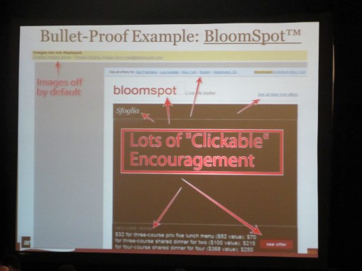
- Work with bottom navigation. Often you might send a newsletter containing products that aren’t interesting for all your customers, but maybe they want to visit your site to check on something else. So make it easier for them! Bottom navigation often results in an increased revenue. Do consider all navigation in your letters. Bloomspot is a good example to show that where there are pictures with Alt-text, the traffic is most intense.
- In A/B tests there havn’t been one single example showing that the longer letter looses in any way compared to shorter ones. Interesting, isn’t it? So, long letters are something you can use. But the readers behave as they were reading a list if the letters are long. They read the first parts and the last ones. Something to remember!
- When it comes to design and structure of a newsletter we often look at bigger companies. Don’t do that any more! Because the big companies are often the ones that handle blocked pictures in the least effective way. Amazon and Walmart don’t have Alt-texts that tell people to download the pictures, for instance. You should always add a link ”Check our offer” or ”Read the letter with pictures” in the mail itself in order to enhance the chances of the readers downloading the pictures. We looked at 3 examples: AppSumo, Bloomspot, and Groupon:
- One way of collecting email addresses is to use a neat pop-up window when the visitors are visiting for the very first time. Ask them for their email address and offer them something in return. In this way you can also send them: 1. An abandoned cart-email, 2. An abandoned site-email. See? The Americans know how to sell. 😉
- Follow the subscribers when on your site. Where did they leave? On the landing page? What can you do to make them buy? Email subscribers are generally spending more time on your site than ordinary traffic.
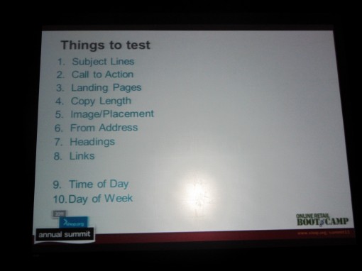
- Make tests of one thing at a time and do it in the right order. Here is an example of an order in which you can test various things:
This is a little sample of what we’re talking and hearing about here in Boston. Now I’m off to next seminar. (Just one more thing: I do like to be a princess again! Some time ago it wasn’t so cool to say that you were working with newsletters. The thing to be doing was about social media – then you were the princess. But see, now I’m back! How I love Boston!)
Thursday, 1 September 2011
…than the ”spammers”! I’ve had so many conversations with people who don’t feel that it’s important to ask the recipients’ permission before they send newsletters to them – or they try to almost hide the unsubscribe button. This is how it is: If you want your newsletters to look like spam – suit yourselves – send your newsletters to all possible e-mail addresses without the owners permissions and nag about selling. To succeed as a real spammer you also must do everything you can to hide the unsubscribe button, preferably at the bottom of the page in a minimal font-face…
You know, I don’t really understand why we have to talk about this any more! Because if you want to be a serious retailer who builds a relation with your customer, well, there are no short cuts. What irritates you, most certainly will irritate your customers! Don’t underestimate them!
I f you want a lot of e-mail addresses – be a little inventive! Offer people something in return when they show trust in you. Here’s a good example:

As soon as you enter the home page of Karmaloop they ask you for your e-mail address and you get a discount on your first buy. This offer also gives you a hint that you’ll get good offers in the future as well. And you have the opportunity to follow them on Twitter, Facebook a.s.o.
Next example:

This example may not be very remarkable, but you can choose the language you want your newsletter in. It’s a way of showing that they want to do it the customer’s way. The example is from Efva Attling.
Regarding the unsubscribe button I’ll try to find some funny examples for you a little later on. I just want to tell you this: The reader/customer wants to be in control, so if you give them that impression and they feel safe you have a much keener reader/customer. Better readers = a better quality of your address list. That, my friends, will increase your sales.
So come on, you know better than this! Be a little more inventive and put yourselves in the position of the reader. It’s 2011 and we’re talking about a modern channel. Don’t be reactionary! I know you can do better if you really think about it and act accordingly!
Sarah@@@@@
Page 2 of 7«12345...»Last »


