All posts in ‘Seminars’
Thursday, 12 July 2012
In the end of last month I visited Compost E-Mail Seminar. I really liked it because Compost is so focused on e-commerce and e-mailing. And they don’t concentrate only on newsletters, but on how the customers are taken care of – e.g. by various kinds of event controlled e-mails, often triggered by something the customer has done on the web for instance.
Compost’s work with e-commerce matches very much what I’m doing within the fields of e-mailing – and Mystery eShopper. When Lena and I work with the testing of e-commerce companies we see many different e-mails: e-mails confirming a purchase or a packaging/delivery of goods, evaluation e-mails, newsletters, customer service e-mails and many more. All these types of e-mailings give us a clear picture of how well the communication of a company is synchronized. This is what I lectured about on the Compost E-Mail Seminar, but I will write a little more about that some other time.
Here is a check list of the ingredients you should include in a confirmation e-mail. Be my guest!
- Remember to show that the customer has made a perfect choice by making a purchase from you.
- Write from a valid address. (Avoid a no-reply address!)
- Remind the customers of who you are in the subject line. Mention the purpose of the e-mail.
- Say thank you to your customer – regardless of the sum of his/her order.
- Forestall possible questions from your customers. Make sure that the answers are available in an easy way.
- Be short and precise, so that the customer gets an overview. Short sentences, preferably dot lists.
- Clear call-to-actions. What is the customer supposed to do next?
- Be personal, even if it’s on a simple level.
- Make your logo type clearly visible to increase a quick recognition factor (spammers often send e-mails looking like confirmation e-mails).
- Make sure that all kinds of information is included. Make returns and other changes simple.
- Show the customer that you appreciate the data he/she has given you and that you’ll use it to his/her advantage.
- Tell about the buying conditions – which will increase the customer’s sense of security (or show where this information is to be found in a clear and simple way).
- Clearly visible links to your home page.
- Write your newsletters in HTML, use pictures.
- Give your customers good and relevant offers – after you’ve given them something of value.
Good luck! Sarah@@@@@
Sunday, 1 April 2012
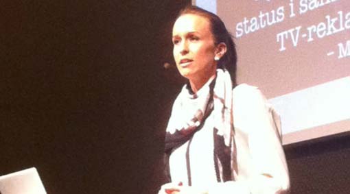 PHOTO: Internetworld
Sarah lectured on the Webbdagarna, Stockholm Sweden, last week. The topic was the Generation Y – a much appreciated presentation.
You’ll find the article on Internetworld.se (in Swedish).

By Christopher Mansson
Category: Seminars
Monday, 5 December 2011
Here’s another ingredient – one of the five that Sarah lectured on during the webbdagarna a couple of months ago. (You remember when she was talking about generation Y and e-mail marketing.)
Generation Y (people born between 1980 and 2003) is a very ”shop inclined” target group. If you give them a good offer in a newsletter, they won’t say no!
If you are an e-retailer, I recommend you to use the e-mails you already send to your customers. An e-mail receipt, a confirmation of order, the answer you send to a customer for ordering from your web shop – they’re all perfect for offerings and increased sales. If it’s not too complicated to add a link and a picture in your e-mail receipts this might be a good idea for a small e-retailer to try in December. Try out adding simpler things and measure what results they give.
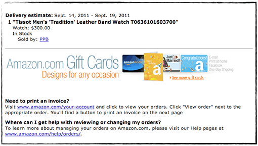
Amazon, for instance, increase their sales by reminding their customers of gift cards in the e-mail receipts they send out.

To do this they use an ordinary image link, which they then are able to trace to the e-mail receipt. The link has a little reference at the end telling that the visitor entered from an order confirmation e-mail.
This is how the link looks:
https://www.amazon.com/gp/gc/ref=gc_orderconfirm_email_hol
Tracing a click from an e-mail is usually not very advanced. So think about it!
E-retailers in Sweden don’t seem to use gift cards very much… Why?
Monday, 5 December 2011
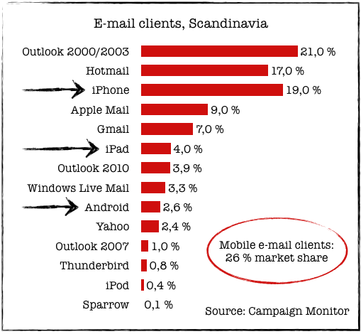
A couple of months ago Sarah visited webbdagarna in Gothenburg and lectured about what the Y-generation finds enticing in e-mail marketing. Among other things she pointed out the ability of the Y-generation to absorb new technology. Right now it’s smart phones and tablets that’s eating the consumer’s market. These mobile units also have an impact on the market for e-mail clients and in what way we read our e-mails.
Ben Richardson, the founder of Campaign Monitor (an international e-mail service provider), has been generous enough to give us some current statistics for the Scandinavian market.
This is how it looks:

So the mobile e-mail clients cover as much as around 26 % of the Scandinavian market. This is a very high number and it continues to increase – rapidly. It’s also higher than the global number, which is around 18 %. You’ll find the global statistics and more details at Campaign Monitor’s web site.
Now when we know this you should consider how your newsletters look and what you can do to adjust them to mobile devices. Of course we’ll talk more about this at our blog.
Thank you, Ben Richardson, for the statistics!
Wednesday, 14 September 2011
I’m in Boston at shop.org and I’m doing my best to listen to all the seminars. In general I guess you could say that we in Scandinavia are wrestling with the same problems as the Americans when it comes to email marketing. Most e-retailers don’t experience the same positive figures in opening frequency, clicks, and conversion as we did a few years ago. 95 % of the Americans have their pictures blocked – according to Ryan Urban at Acquisition. Social media seem to have gathered most of the attention here also – and email hasn’t really been regarded as a social medium, although it is really.
Stefan Tornquist started his presentation with a question about how many in the audience wanted to have ”Facebook likes” rather than their customers’ email addresses. I think the answer is pretty self-evident. Of course we prefer their email addresses. I liked that introduction very much; we didn’t have to waste any more time declaring the impending death of emailing. As you can understand the topic of the day is emails and for the very first time in months I think I heard some new things… Well, not that many new things, but still… 😉 Something that we’ve heard a lot here is that emailing is what drives conversion! Everybody really acclaims emailing here.
Here are some points I’ll bring home:
- The header or title of the newsletter should be shorter than we’ve said before. Not more than 30 letters, absolute maximum is 40 letters – blanks included. Quite a few e-mail clients cut off a text longer than approximately 40 letters.
- Convince your customers that your newsletter isn’t spam. You gain trust by using a well known sender name in combination with telling why you make this contact.
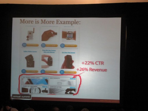
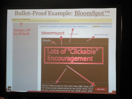
- Work with bottom navigation. Often you might send a newsletter containing products that aren’t interesting for all your customers, but maybe they want to visit your site to check on something else. So make it easier for them! Bottom navigation often results in an increased revenue. Do consider all navigation in your letters. Bloomspot is a good example to show that where there are pictures with Alt-text, the traffic is most intense.

- In A/B tests there havn’t been one single example showing that the longer letter looses in any way compared to shorter ones. Interesting, isn’t it? So, long letters are something you can use. But the readers behave as they were reading a list if the letters are long. They read the first parts and the last ones. Something to remember!
- When it comes to design and structure of a newsletter we often look at bigger companies. Don’t do that any more! Because the big companies are often the ones that handle blocked pictures in the least effective way. Amazon and Walmart don’t have Alt-texts that tell people to download the pictures, for instance. You should always add a link ”Check our offer” or ”Read the letter with pictures” in the mail itself in order to enhance the chances of the readers downloading the pictures. We looked at 3 examples: AppSumo, Bloomspot, and Groupon:


- One way of collecting email addresses is to use a neat pop-up window when the visitors are visiting for the very first time. Ask them for their email address and offer them something in return. In this way you can also send them: 1. An abandoned cart-email, 2. An abandoned site-email. See? The Americans know how to sell. 😉
- Follow the subscribers when on your site. Where did they leave? On the landing page? What can you do to make them buy? Email subscribers are generally spending more time on your site than ordinary traffic.
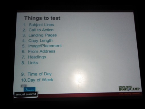
- Make tests of one thing at a time and do it in the right order. Here is an example of an order in which you can test various things:

This is a little sample of what we’re talking and hearing about here in Boston. Now I’m off to next seminar. (Just one more thing: I do like to be a princess again! Some time ago it wasn’t so cool to say that you were working with newsletters. The thing to be doing was about social media – then you were the princess. But see, now I’m back! How I love Boston!)

 PHOTO: Internetworld
