Tuesday, 13 December 2011, 9:40 AM
Clearly Structured Newsletters with Enticing Preheaders
I believe I’m talking on behalf of both myself and Sarah when I say that simple and clearly structured newsletters are the best. Sarah noticed this newsletter on Campaign Monitor’s site and thought it was a good example.
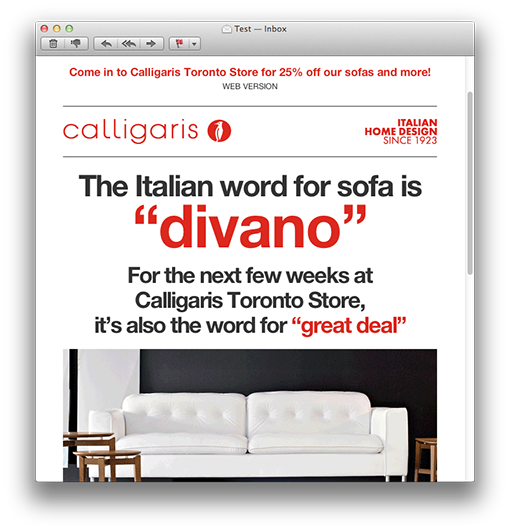
I like the way Calligaris keep the letter short and how they have divided it into clear sections.
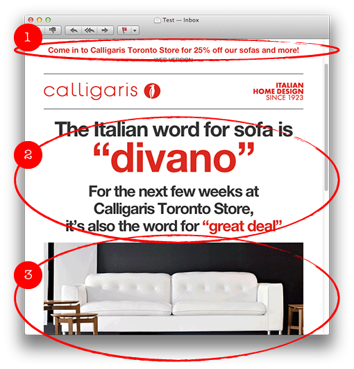
1. The preheader, that is placed before the header in a mail, is more in focus directly in the inbox in modern e-mail clients. Calligaris give their preheader plenty of space since they let it run across the whole width of the newsletter. Why this is such a good thing you’ll see in the screen shots far below in this post.
2. The main content is graphically very spectacular and it almost looks like a picture, but it is in fact made as a text in various colors and sizes. This mail with a good balance between text and pictures easily passes through any spam filter.
3. The big picture is a gif animation shifting between two different pictures – a smart solution to keep the newsletter short – you don’t have to have several big pictures. Gif animations don’t work in some e-mail clients, but that doesn’t matter so much since the first picture in the animation always is visible anyhow.
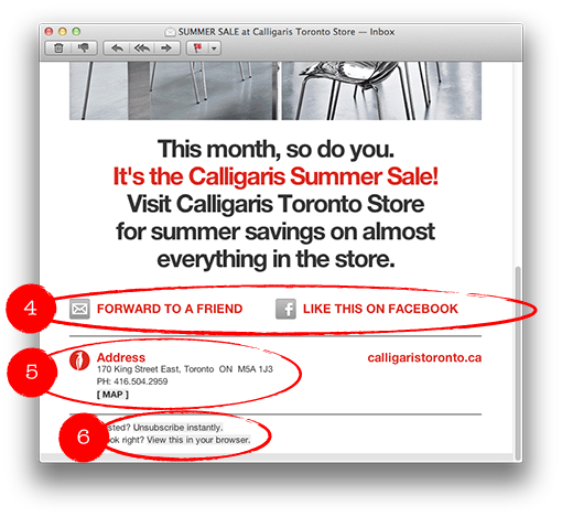
4. Clarifying links with texts and icons, in order to forward the letter or to like it on Facebook.
5. Address and a link with a map to the store is of course a kind of information the customers want.
6. A link to instant unsubscription – exactly how it should be.
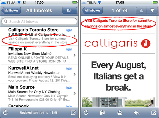
This is how the newsletter looks in an iPhone, and like I said, the preheader is exposed directly in the inbox.
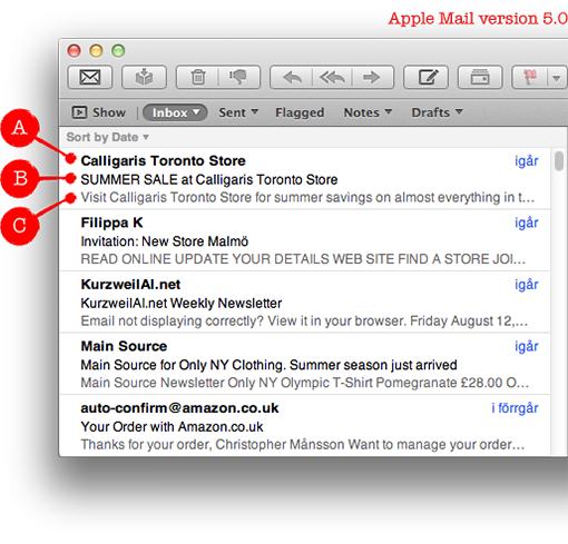
The same is true for a Mac, in the new Mail. Apple shows the preheader directly in the inbox. It’s possible to turn it off if you don’t like it, but now you can see not less than three parts with the standard settings in the e-mail client:
A. Name of the sender
B. Subject line
C. Preheader
To sum up: Think twice about how you use the preheader in your newsletters! More and more people can see it even before they open your e-mail.
This is a very well-made newsletter and I’ll give it four hearts.


