Thursday, 6 September 2012, 4:32 PM
Microsoft’s New Web Mail

I like it!
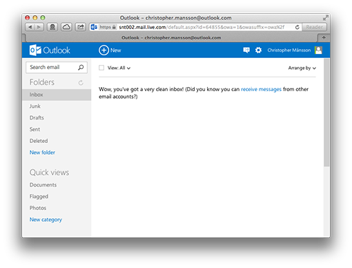
It’s clear, simple, and it’s focused on your e-mail. You can log in with your existing Hotmail account – if you have one.
Here’s the new Outlook.com.
I think Microsoft is on the right track with this new and stripped design. Rounded corners, shadings and glass reflecting lights – the time for those things is over!


