Wednesday, 26 October 2011, 9:08 PM
The Bodum Newsletter
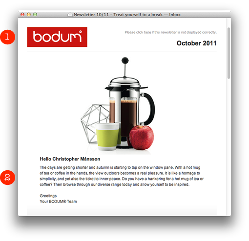
The Danish family company BODUM presents this neat and simple newsletter:
1. A clean header with a clear sender.
2. A fine product picture with a personal greeting. It’s important to say hello to the subscriber before you try to sell something. It’s like in “real” life: You do greet the customer before you present your products or services, don’t you? Not everybody likes to have offers thrown into their faces, just like that…
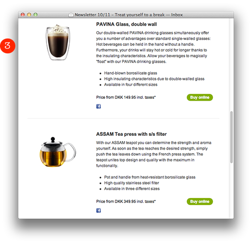
3. They briefly list their products with a clear product picture, an informative text, price, and a distinct green “Buy online”-button to the right which brings you directly to their web shop.
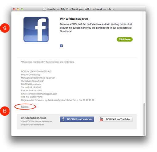
4. Sweepstakes work well in newsletters. In this case BODUM links to the sweepstakes on Facebook. Sarah and myself have seen unusually high activities in newsletters where they emphasize various possibilities to win prizes.
5. An informative footer with links to the channels on YouTube and Facebook. Also notice the little link “Privacy”. If you click there you end up on a page where you’ll find this text:
Any personal information gathered by us will be used solely for the purpose of order processing. We will not sell, traffic or hire out your personal data to third parties.
We like!
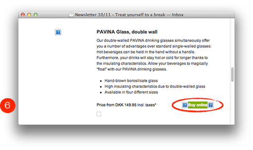
6. Note that the buy button isn’t a picture, so it’s visible even when the pictures are blocked. Well done! I’m sorry to say though, that they’ve forgotten the alt-texts for the product pictures.
Unfortunately the product picture on the top of the page is inverted in an iPhone. I think they might have saved the picture in a wrong way. But apart from that the newsletter works well also here.
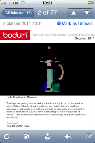
What is evident is that BODUM has missed out concerning the alt-texts and a better preheader. Otherwise everything is neat and clear. Four hearts out of five!
![]()
I bought these big tea mugs with rubbergrips in various colors. I do recommend them. They’re awesome!
