Thursday, 26 January 2012, 6:41 PM
There’s a Monkey in My Newsletter!
ThinkGeek’s online shop – which I describe in short at I love e-commerce – also has a newsletter and it turned up in my inbox on Cyber Monday – of course.

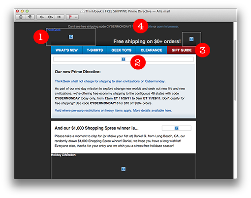
1. This is what the newsletter looks like when the pictures are blocked. There are alt-texts in all the pictures so we can understand what they contain and the picture sizes are mentioned in most cases.
2. The height of the big picture at the top isn’t stated though. The result is that this particular picture, which is very big, is comprised to a narrow string, so the first text paragraph lands high up. The reader is thus able to read the text without having to scroll the page. So the people who’ve coded this newsletter are evidently skillful and know how to do this.
3. The buttons atop are made in text and not in pictures, which otherwise is quite commonly done. Text buttons are always clear and visible. It’s not easy to make text buttons clear and trim in e-mail clients, but in this case they have really succeeded.
4. They have squeezed in the reduction code ”Cybermonday” in the preheader also, which you can see in the inbox together with the subject line – they combine the subject line and the preheader in this newsletter. The preheader is like an answer to the subject line. Good!

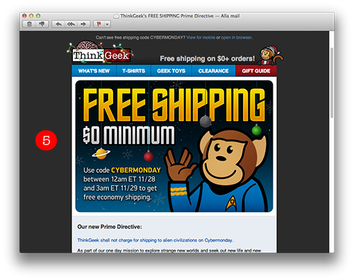
5. This is a good-looking letter with fun and catching graphics. It’s easily noticed when people work a little extra and make their own graphics instead of buying pictures; it makes the newsletter much more interesting and enticing. The monkey also turns up on their site when you want to ask for help. They have built up a clear theme around this monkey – whose name is Timmy – and you immediately recognize the company because of Timmy in combination with the ”geeky” graphics.

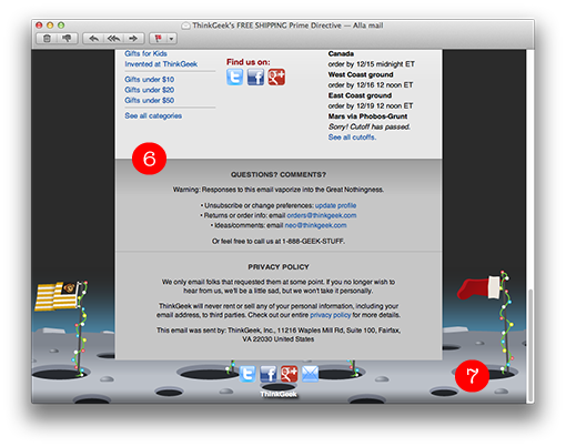
6. They also have a fantastic footer with quick links to various product categories on their site and also contact information out of the ordinary. Apart from telephone numbers and information about where to turn concerning orders, they ask the customer to get in touch with them with comments and ideas. Finally they tell the customers that their data are safe with the company and will never leave ThinkGeek.
The content of the newsletter contains offers, but also prize competitions (the winners are presented in the newsletters too). A good way of giving the customers a sense of engagement.
7. The interesting background picture is made so that it ”disappears” in a nice way without disturbing the look of the newsletter in, for instance, Gmail and other webmail clients where it doesn’t work.

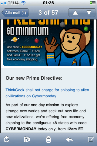
The newsletter works perfectly well in a smart phone too. The text is big enough and very clear, so I need not to zoom in to be able to read the text.


