Monday, 1 August 2011, 9:11 AM
There’s No Topic Too Specific for a Newsletter
A newsletter about fonts only – is that okay? Of course it is, at least if you’ve got the world’s largest collection of fonts on the web.
I subscribe to MyFonts’ newsletters for inspiration, but also because of my interest in typography.
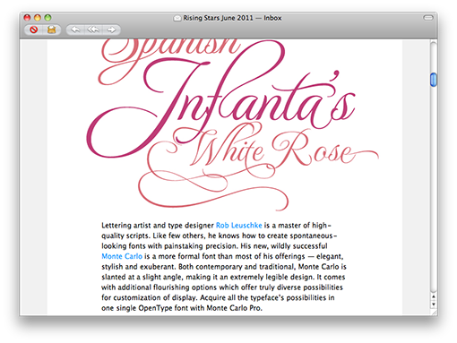
I do like the way they present the fonts – big and clear – with a little story or presentation of the designer for every font. Maybe the pictures are a bit too large, though. Even so I feel that the relation between text and picture is well balanced, which is a good thing, otherwise the letter might get stuck in spam filters, and it’s easy too scroll through the fonts to see if there’s something you like.

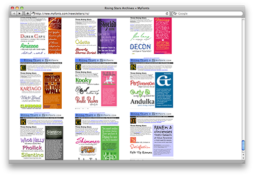
There’s a big newsletter archive on the web since seven years. It’s pretty fun to compare the very first newsletter of 2004 with the latest one of 2011.

The question is how it’s possible to keep a newsletter alive for so many years. But obviously there’s no topic too narrow or specific for a newsletter. The circle of readers is probably limited – but surely dedicated.
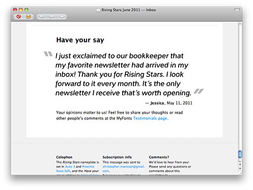
At the very bottom of the letters there’s a little space for the readers’ comments.

I have designed my own fonts a few times and I can testify that it’s quite demanding when it comes to precision and very time consuming! It’s not to be recommended for someone without a great deal of patience. I haven’t so far dared to try fonts with serifs; I still keep to the straighter ones.
Here’s my latest procreation:


