All posts in ‘Communication’
Thursday, 20 December 2012
The advancement of ASOS in the Nordic countries is much admired. And when I check the e-mails I get from them I can see that they continuously are testing and evaluating the responses they get from their various e-mails and newsletters. In this blog post I’d like to show you some of the tests they do concerning subject line or title. If you want to know how to form a good subject line – maybe ASOS can inspire you.
I will also show you something that I personally like a lot. Despite ASOS’ focus on sales they do vary their e-mails; sometimes ”e-mails for selling”, sometimes ”e-mails for value”. When they give their customers something of value they can probably expect to sell even more in the following newsletters. You can call it bartering. ASOS gives the customers value and then ASOS can expect that they’ll buy something from them later on.
I am registered by two addresses with ASOS and I’m happy to have two different examples of the same e-mail every time. Otherwise I wouldn’t have discovered this. Look at these two e-mails: The same e-mail, but the introductions are a little different.

In this case they choose to have the very first words identical, but in the first one they add something to see if they will get more customers to open the e-mail. What about the rest of the letter? The headlines in the newsletter aren’t the same as in the subject line of the preview pane.

And the second one:

Another example:

In the second example above they are testing the effect of being a little provocative. I think that’ll work quite well in some countries. But I think I would be somewhat careful using ”Hey hot stuff!” I think about spam filters. The same goes for the word ”Game”. Though in this case it worked since it landed in my inbox. This time the two varieties had the same head title.

I also noticed that in several e-mails the top of the newsletter and the first offer were identical, but after that the offers were different, or the pictures and the title were different – but the offer was the same. Obviously they did this for the sake of testing what was more attractive to the recipients further down in the letter. Here is an example of that same e-mail, but with a different layout of the same content.

The other alternative:

So it is possible to put together the same content, but vary the look of the offer to see what works best OR to have exactly the same content, but try out the order of the content. I sure would like to work more with this when you e-mail service providers give us a SIMPLE function to use 🙂
Last, but definitely not least: In what ways do ASOS vary their messages in the different newsletters and e-mails? Well, it’s a lot about selling – but they blend in letters of value also. I know there are a lot of e-commerce people out there who claim that it’s only sales messages that are worth while … Yes, I know you feel that way. But in order to keep more than 25 % of your customers shopping you have to vary content more, especially if you don’t personalize your newsletters. If you follow my advice you’ll see a long lasting effect – and I’m sure you would like to give your dear subscribers a value now and then instead of always be nagging about selling.

See what I mean? Sales, sales, VALUE, sales, sales, sales, VALUE, sales a.s.o.
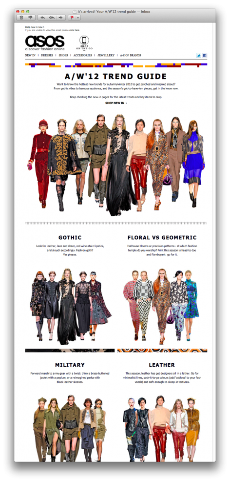
One of their ”value-emails” looked like this:

And look how they structure the newsletter and make it easier for their readers to find suitable category – and how well it’s adapted for portable reading devices, too. Nothing about selling, just a guide to find the right clothes. Do you think I shop from ASOS? You bet I do!
Wednesday, 20 June 2012
This e-mail message has been sent to info@iloveemail.se in accordance to the rules for e-mail marketing in the Data & Marketing legislation in Europe.
This is what is said in quite a few of the newsletters from Swedish companies and these newsletters frequently land into our info addresses. Those are letters we do not want.
It´s a great pity that Swedish companies choose to send this type of uncommissioned newsletters. Why don´t they wish to communicate and create relations with their customers? Why do they use a legislation from the European Union as an excuse to avoid a marketing opportunity?
Please do NOT answer this message, since it is sent from an e-mail address that is not monitored.
This is usually written close to the unregistration link. Obviously they do not want to take responsibility for their marketing since the company makes it difficult for the customer to get in touch with them. Do send all your messages from an e-mail address that is available.
This newsletter is being sent to you since you are registered in our data base.
Why are people´s names in your data base? Avoid buying data bases with e-mail addresses! It will be very evident that you don´t really care about your customer registers if you do.
Enough of bad examples. Here is one worthy of imitation. It´s from Kjell & Company.
You receive this newsletter because you are a customer of ours, you have ordered a catalogue from us or you have registered for newsletters from us (read more). If you would like to unregister, it´s really easy, just click here. We would be happy to receive your view on this e-mail or on our products. Please send a message to kundtjänst@kjell.com.
Monday, 16 April 2012
I feel it’s really interesting that an increasingly number of people choose to develop an attractive bottom navigation bar. When I visited shop.org in Boston there were representatives for ever so many companies telling about how sales in the bottom navigation bar increased immensely. Especially from smart phones. It is as the recipients quickly scroll through the newsletter and when they don’t find anything particularly interesting they seem to appreciate some kind of clear categories at the bottom of the newsletter. Most companies telling about this estimated the sales from the bottom navigation bar to 30-40 % of the sales from the newsletter. Check these examples:

Carter’s has three clear boxes which makes it easier for the readers to go on and to shop. It’s really simple to continue from a smart phone also. The link texts aren’t too small either. Good!

OshKosh B’gosh has the same type of clear ”call-to-actions”. Why does it work so well to ”order” people what to do? Maybe because we feel that it’s nice to hear someone telling us what to do in the stream of confusing(?) information we get every day. (At least that is what I was told at a webinar about Pinterest two weeks ago.)

American Eagle Outfitters has a more ”timid” design, but with the same function.

Marks & Spencer has extremely clear ”invitations”, simple to click on in small entities. In addition they make me feel a little special since the offers only exist online. There is a value in being a subscriber of their newsletter.

And don’t forget to check what it looks like when the pictures are blocked and do tell what your customers are supposed to do in your alt-texts. Make a test – I believe that you’ll have more clicks than you think.

Wednesday, 14 March 2012
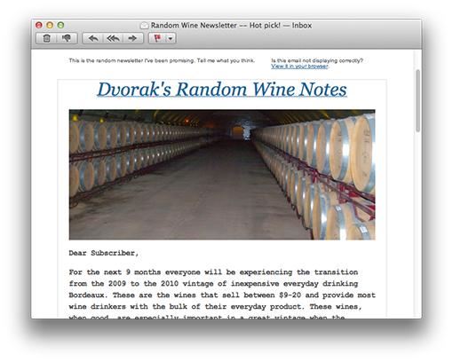
Last Sunday I chose to read one newsletter, a newsletter that I subscribed to more than 6 months ago. But it didn’t show up until now.

The subject line wasn´t that exciting: ”Random Wine Newsletter”, but nevertheless I opened it since I recognized the sender.
The preheader reads: ”This is the random newsletter I´ve been promising. Tell me what you think.”
I like this newsletter.
The design isn´t exactly breathtaking and among the hundreds of points I would be able to mention as a description of a successful newsletter, the sender of this one has only succeeded in hitting one of them – the sender is a person and the content is personal. This is a long personal letter to the recipient and sometimes this is all you need.
Let me put it this way (and I do think that most people would agree on this):
”Random” tips from a sender you trust will be read. Good and substantial tips from a ”random” sender won´t even be opened. What a waste! So the name of the sender is crucial.
Monday, 6 February 2012
This is a dangerous question to answer in printing, right? I might be wrong about it and it might be held against me one day. Anyway, I have thought about it a great deal and, daring as I am, I will reveal my conclusions about e-mailing in the future.
Social media have an influence on e-mailing
A great deal of the changes we are about to experience are due to the influence that social media have on our possibilities to communicate in whatever way we prefer. People working with marketing often talk about choosing the right channel for a particular target group. This sounds easy, but it isn’t – far from it! I’m really disturbed over the fact that we haven’t reached further. Our desire isn’t primarily to send a text message or to send an e-mail or to chat – no, the desire is to COMMUNICATE! So when will we marketers start talking about communication rather than channel? We’re occupied with measuring and analyzing every channel to know what to go for. What Facebook is teaching us through their new communication system is that the user is offered many various ways of communication and that it’s for the users to choose. Words that are defining the new way of thinking are: seamless, informal, immediate, personal, simple, minimal, short.
Don’t get stuck in a certain channel (and what if e-mail is going to die?) – instead: consider what you want to communicate.
Mark Zuckerberg said this (when he introduced the new communication system on Facebook):

This is not an email killer. This is a messaging system that includes email as one part of it.
Apple, Facebook, and Klarna are examples of companies chipping in a lot of resources into making their services and products as smooth and lean as possible for the users. The e-mailing world must do the same. When it comes to the choosing of an e-mail service provider, the one who works with the tool and creates the newsletters must have a say about how well it works for him or her.
If it appears that the system goes down now and then: cut! Considering what I said before about the fact that we want a simple and quick way of communication, your e-mail tool must have the capacity to send out letters promptly – and maybe even unscheduled.
So check all your processes and how they are understood by your subscribers. For example:
- The registration process must be clear and simple.
- The information about your customers must be controlled by themselves; make it simple for them to change any data.
- Make it evident for your company what has been changed and act accordingly.
We’ve ”preached” a lot about e-mailing – but do all our hints still work? You have to check that! Maybe we should have another headline? (Think twitter!) When we think Facebook – maybe sheer text mails will come back? Consider these things, make some tests, and be open minded. Always mind your target groups!
The smart phones change a lot of things for us!
So here I am, joining the crowd that nag about the smart phones changing everything and that it’s time for action about this. Earlier the day, and even the hour, for sending a newsletter was extremely important. This was because we wanted the newsletter to hit the inbox when the subscriber is at his/her computer ready for a little reading. But with the smart phones this will probably change in some way. Now we’ve got the inbox with us all the time – even beside our beds. I’m not saying that the timing isn’t important anymore, but rather that this is changing and that we must be aware that so many people are reading their newsletters in their smart phones and we must learn how they react when they do so. And we just have to adjust the newsletters to that little screen. An example: You click on something (a slow connection too) and because of the small size you clicked on the wrong link … Isn’t it enervating?

The subscriber decides what is SPAM, not Google.
So many people have been raging over the Gmail Priority Inbox. They mean that maybe the newsletters don’t land in the best inbox or maybe are considered to be spam or are shown further down on the important list over all the e-mails in the readers’ inbox. All of which would be a catastrophe. Forget it! This has been way too exaggerated.
Facebook has shown us that it’s the user who decides to ”like” you or to accept you as a friend – and then you are able to communicate with this person in whatever way you prefer. BUT you must deserve trust and you must take care of that trust. So here we are again – the most important as far as e-mailing is concerned: you must show that you deserve to own that e-mail address and you mustn’t misuse that trust. If you already are working according to this you won’t have any problems with it in the future either.
I may be wrong about one or several points here – but if I’m not: It’s always good to be prepared and start thinking about what the future is offering you and your customers.
Sarah@@@@@
Page 1 of 712345...»Last »


