Monday, 8 November 2010
I have to admit, when we change the design or attitude and sound of our newsletters, I get a little worried that our readers won’t recognize it or feel at home, and I don’t want to lose them. eROI News is a great example of how to get around this. (Assuming that your newsletter isn’t an ever-changing one.)
What eROI News does, is they make a big deal out of the changes that they make. They then tell the reader why. It’s that they want to give the reader an ever evolving experience into something better. eROI News wants feedback. They want to know what their readers think of what they write. They want dialogue, not monologue. And that’s why they’re pouring more energy into social media.
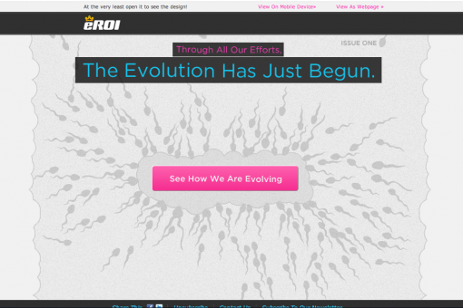
Take a gander at the different designs:

The picture above is actually four different parts that are stacked up on each other. Just a gif animation. So the little sperms are wiggling wildly on the page, and your curiosity is killing you. See for yourself HERE.
Isn’t it awesome with the header across the page?
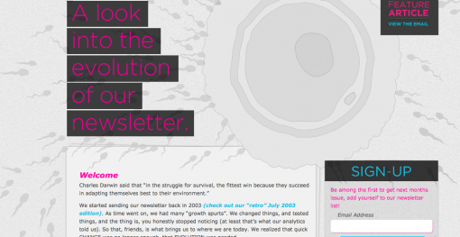
So when you click the link (which is obviously and irresistibly the only choice you’re left with) you come to this page:

Click on the picture and read it, it’s pretty great!
The fact is, when you send out a newsletter that’s very similar in design and content month after month after month, sometimes it’s just a good idea to break it all up and try something totally different. Give it some new content. But this doesn’t mean that you just send one more newsletter. It means you replace a newsletter.
eROI News kept me reading to the end. And I’m pretty busy tonight. They are completely honest with the fact that too many readers have lost interest in their newsletters. But this is all said positively – they want your attention by evolving the letter around us and for us, the readers.
So, If you decide to make the change, don’t trickle in the changes little by little. Drop a bomb on them, blow their mind. Make them feel unique. Show them that the change is for them… (assuming this is the case).
Anyway, I really liked this. And I like that there’s a lot of thought and energy behind it, for me, a reader.
The only minus is, that if the pictures are blocked… you see nothing.
Four wonderful hearts out of five.

Tuesday, 2 November 2010
I found something for you to feast your eyes on. This is nice.
So, I said before that I would love to see more newsletters with a consistent “language” and thought behind it. The point is, that it has to make sense to the reader, they need to be able to easily find the “subscribe” or “unsubscribe” buttons for example. Here is a perfect example of this… Even though this is a newsletter entirely about photography they didn’t flood it with pictures, since many may be blocked anyway.
I went to the MailChimps blog and they were talking about this letter. LeahAndMark.com is the brains behind this newsletter. Very simple, and very well thought out.
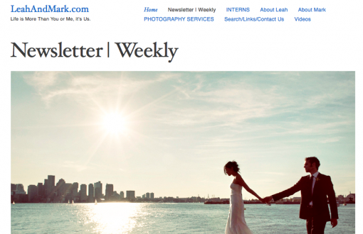
Below is a screenshot of their website, you can see how easy they’ve made it for you to register for the newsletter, front and top center, staring at you. They even slyly tell you that it comes every week.

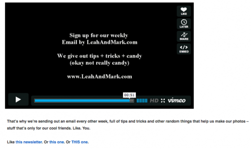
When you click “Newsletter/Weekly”, a big picture shows up with all the logical reasons why you should register. Then a tempting video to make anyone slightly interested in photography scramble for the subscribe button. I’m sold.

This is interesting, they give you examples of what their newsletters look like.

They don’t ask for more than your name and email address. Simple, easy. LeahAndMark want to have a list of people who really want their email, so they use double opt-in. This means that they send you an email with a link in it that you have to click on to tell them that you really want to subscribe. This is something that a lot of email marketers are afraid to do because they don’t want to risk it being missed. But, this is a great example of how to make it easy for us to actually CLICK … And, it’s all in HTML 🙂 Not in the standard text version that all of the suppliers think we should use.
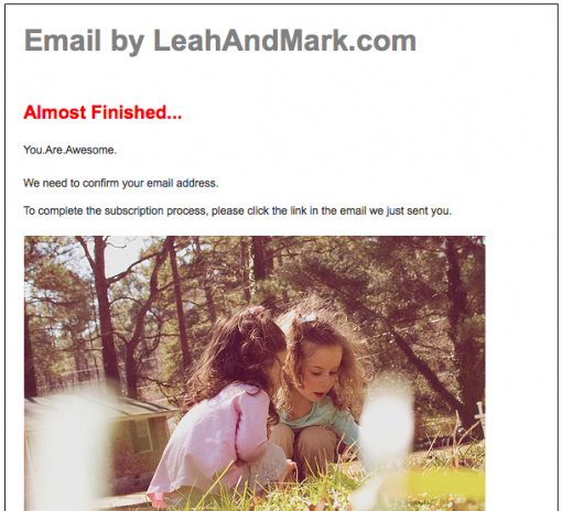
Then they tell you that you’re “Almost Finished…”, so you know to go and check your email to confirm it. And that’s it, bye bye long and terrifying forms to fill out.

So what’s that confirm email look like? For one, there’s no mistaking who it’s from with the mammoth sized “Email by LeahAndMark.com” link. It’s pretty clear what to do next, and I happily … Click.

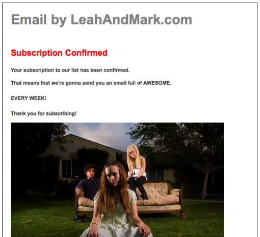
Soon as I click… Bling… I have an email in my inbox confirming that I… confirmed, and am now a subscriber. I’m also reminded of how “awesome” the email is and of course how often it will come.

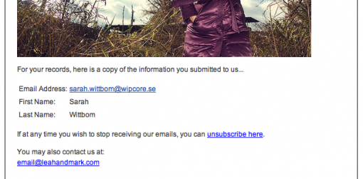
It’s not over yet… A little later I get an email where they remind me of what personal info I gave to them… and brace yourselves people… they show me how to unsubscribe! It’s genius, because now I know how easy it is to take myself off the list, which means I’ll stay for infinity and beyond.

And they don’t hide how to get a hold of them. In fact, if you peek at the bottom of the email, they include a “LeahAndMark.com.vcf” file, which is a contact file you can add to your desktop contacts etc. Crazy!
So, what makes this so awesome?
They have the same ”language” and design in ALL of their letters – this means security and trust.
Clarity – this gives them a quality list of subscribers that really want their newsletters.
They have personal style that reminds me of blog language without losing its seriousness – creating a relationship with the reader.
All of the necessary communication was there during your peak interest.
They adapted to email’s limitations and possibilities.
I get so happy when I see this! What they’ve done here doesn’t mean endless wisdom and intelligence, but it does show that it’s brilliantly thought out, and they really want to take good care of their followers… I’m kind of in love…
Thanks LeachAndMarket.com!
Sign up and see what they look like!
Wednesday, 6 October 2010
It’s not always easy to express yourself in an accurate way through an email. When you compose an email, you may think you’ve phrased your message in a very considerate and balanced way, while the recipient may see it as being harsh and possibly even aggressive. Today I sent an email to a friend, with only good intentions – but, I was in a hurry, that’s all – and her reply was very prompt: ”Why so angry?”
And of course: The way the recipient perceives it is the important part … right?
Once in a while I think about a quote I read in an article a while ago. Torbjörn Johansson of IBM said: ”Emails are very good for conveying facts, but they are not as good for conveying semifinished ideas or plans – and an email could be a catastrophe when it comes to conveying feelings.”
An area where this is extremely applicable is internal communication. We recommend a great policy for internal communication via emailing.
