All posts in ‘Design’
Monday, 16 April 2012
I feel it’s really interesting that an increasingly number of people choose to develop an attractive bottom navigation bar. When I visited shop.org in Boston there were representatives for ever so many companies telling about how sales in the bottom navigation bar increased immensely. Especially from smart phones. It is as the recipients quickly scroll through the newsletter and when they don’t find anything particularly interesting they seem to appreciate some kind of clear categories at the bottom of the newsletter. Most companies telling about this estimated the sales from the bottom navigation bar to 30-40 % of the sales from the newsletter. Check these examples:

Carter’s has three clear boxes which makes it easier for the readers to go on and to shop. It’s really simple to continue from a smart phone also. The link texts aren’t too small either. Good!

OshKosh B’gosh has the same type of clear ”call-to-actions”. Why does it work so well to ”order” people what to do? Maybe because we feel that it’s nice to hear someone telling us what to do in the stream of confusing(?) information we get every day. (At least that is what I was told at a webinar about Pinterest two weeks ago.)

American Eagle Outfitters has a more ”timid” design, but with the same function.

Marks & Spencer has extremely clear ”invitations”, simple to click on in small entities. In addition they make me feel a little special since the offers only exist online. There is a value in being a subscriber of their newsletter.

And don’t forget to check what it looks like when the pictures are blocked and do tell what your customers are supposed to do in your alt-texts. Make a test – I believe that you’ll have more clicks than you think.

Tuesday, 3 January 2012
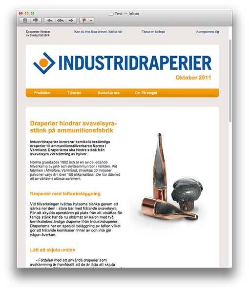
Petter Nilsson of Industridraperier makes a stylish newsletter and he has asked for some comments and a few tips.
This is how it looks:

It’s simple, stripped and has a good-looking and coherent theme. Petter has really succeeded in his design of the newsletter, in my opinion.
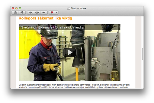
There’s also a film clip in this newsletter and my guess is that the clip gets more clicks than the text links. Generally film clips do get more clicks – at least when it’s clearly indicated that they are film clips. This is something that we increasingly use ourselves.
The film is in the form of a picture of the YouTube-player (that we all recognize) with a distinct play icon. Perfect!

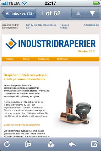
If I choose to open the newsletter in an iPhone, I must say that the text is somewhat small. Since I cannot read it I have to zoom in the parts I want to read. This is something you can solve in two simple ways.

1. Reduce the width of the newsletter. At present the letter is in 660 pixels, but it could be 100 pixels more narrow to look better in a mobile e-mail reader, i.e. 560 pixels.
2. Use a bigger character size. The recommended minimum size in a newsletter is 12 pixels, which is the size of the characters in this newsletter. But it’s advisable to enlarge them to 13 or even 14 pixels.
Even better is a combination of the two suggestions and make the newsletter 560 pixels wide with characters of 13 pixels. Absolutely readable in a smartphone!
The headlines in this newsletter are big, clear, and short. Good! And you’ll find the unsubscription link both at the top and at the bottom – optimal!
There’s a preheader text at the top left side as a complement to the subject line and there is a balanced division between text and picture.
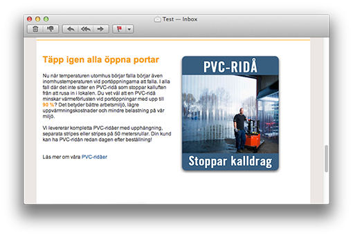
The dark blue text links are maybe a little difficult to spot in the middle of the black text. A suggestion is to move them further down and put them below the paragraph to the right instead.

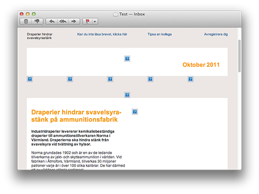
One last thing: Alt-texts to the pictures. When the pictures are blocked you don’t get any idea of what they add to the newsletter:

Mainly this is a stylish newsletter and I choose not to comment on the content – because that’s something that Petter knows best!
Thank you Petter, for your contribution!
I give you three hearts!


By Christopher Mansson
Category: Design
Tuesday, 13 December 2011
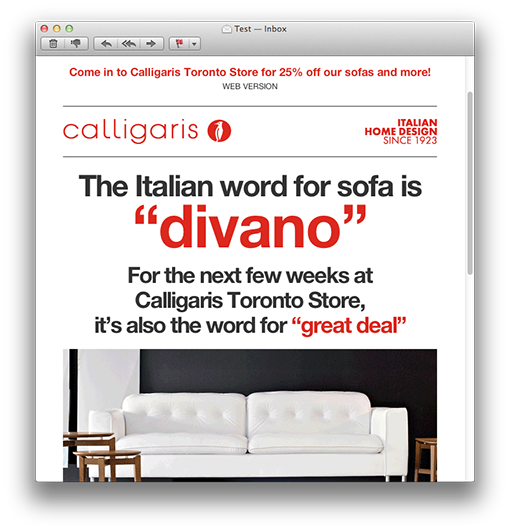
I believe I’m talking on behalf of both myself and Sarah when I say that simple and clearly structured newsletters are the best. Sarah noticed this newsletter on Campaign Monitor’s site and thought it was a good example.

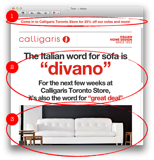
I like the way Calligaris keep the letter short and how they have divided it into clear sections.

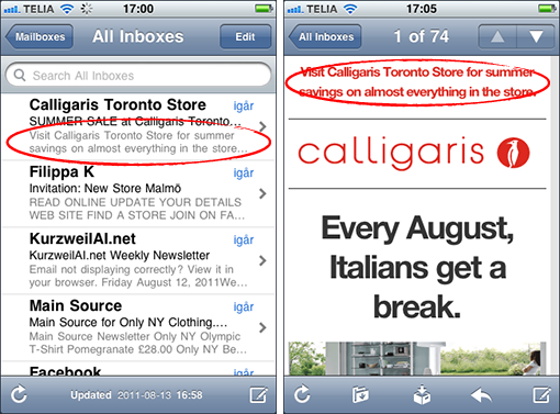
1. The preheader, that is placed before the header in a mail, is more in focus directly in the inbox in modern e-mail clients. Calligaris give their preheader plenty of space since they let it run across the whole width of the newsletter. Why this is such a good thing you’ll see in the screen shots far below in this post.
2. The main content is graphically very spectacular and it almost looks like a picture, but it is in fact made as a text in various colors and sizes. This mail with a good balance between text and pictures easily passes through any spam filter.
3. The big picture is a gif animation shifting between two different pictures – a smart solution to keep the newsletter short – you don’t have to have several big pictures. Gif animations don’t work in some e-mail clients, but that doesn’t matter so much since the first picture in the animation always is visible anyhow.

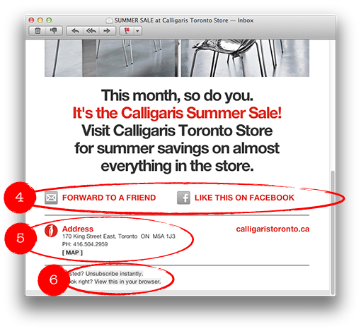
4. Clarifying links with texts and icons, in order to forward the letter or to like it on Facebook.
5. Address and a link with a map to the store is of course a kind of information the customers want.
6. A link to instant unsubscription – exactly how it should be.

This is how the newsletter looks in an iPhone, and like I said, the preheader is exposed directly in the inbox.

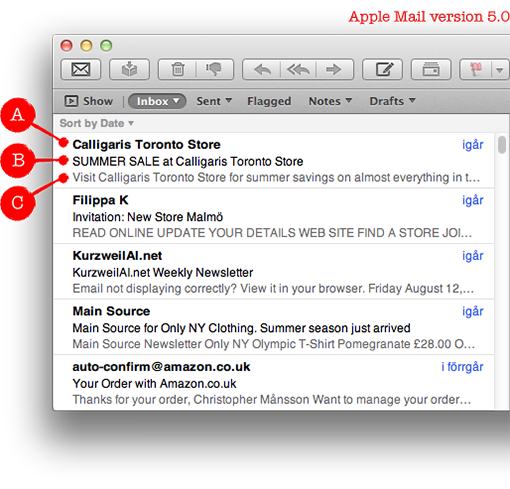
The same is true for a Mac, in the new Mail. Apple shows the preheader directly in the inbox. It’s possible to turn it off if you don’t like it, but now you can see not less than three parts with the standard settings in the e-mail client:
A. Name of the sender
B. Subject line
C. Preheader
To sum up: Think twice about how you use the preheader in your newsletters! More and more people can see it even before they open your e-mail.
This is a very well-made newsletter and I’ll give it four hearts.

Monday, 21 November 2011
Hopingly you all know that we regularly produce a newsletter. Being e-mail nerds, Sarah and I code our newsletters ourselves.
But there’s always something that malfunctions – and last time it was Hotmail.
We have a big background picture which, in fact, works in most e-mails clients: Mac, Gmail, Hotmail, Outlook for PC a.s.o.
You fix a background that works almost everywhere by specifying the back ground picture twice in the coding. Once in ”BODY” and once in an enclosing html-table.
This is how you do it in ”BODY”:
<body background=”http://www.nordicecommerceknowledge.se/ebrev/ebrev-bg1.jpg”>
And in the enclosing html-table:
<table width=”100%” cellpadding=”0″ cellspacing=”0″ border=”0″ align=”center” background=”http://www.nordicecommerceknowledge.se/ebrev/ebrev-bg1.jpg”>
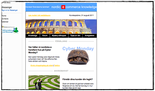
But – it was cut off in Hotmail. The problem with Hotmail is that it only does the background, regardless if it’s a background picture or a background color, as wide as the content is wide. This results in two things: white spaces in the margins and the newsletter is aligned left. Not very trim…

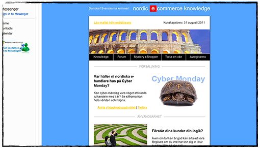
After seven attempts we finally got it right. You have to overwrite Hotmail’s rules for content viewing – which is done with a little CSS-coding at the top of the mail.
Like this:
<style type=”text/css”>
.ReadMsgBody
{width:100%;}
.ExternalClass
{width:100%;}
</style>
Now, see the difference and how nicely the background is showing:

If you want our (Swedish) newsletter you are welcome to register for it at this address:
www.nordicecommerceknowledge.se

By Christopher Mansson
Category: Design
Wednesday, 26 October 2011
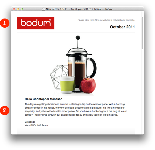
The Danish family company BODUM presents this neat and simple newsletter:
1. A clean header with a clear sender.
2. A fine product picture with a personal greeting. It’s important to say hello to the subscriber before you try to sell something. It’s like in “real” life: You do greet the customer before you present your products or services, don’t you? Not everybody likes to have offers thrown into their faces, just like that…

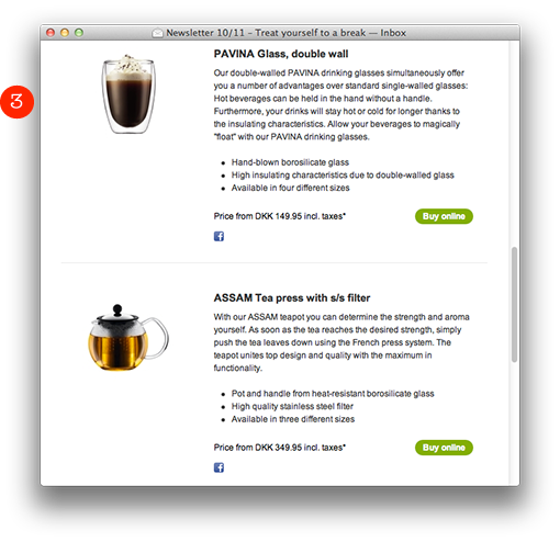
3. They briefly list their products with a clear product picture, an informative text, price, and a distinct green “Buy online”-button to the right which brings you directly to their web shop.

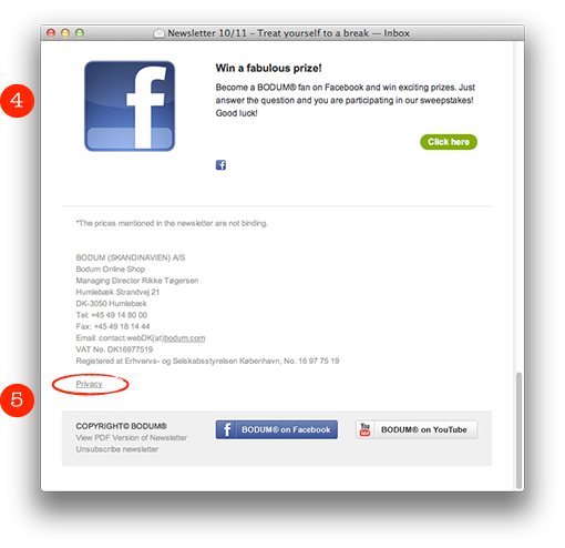
4. Sweepstakes work well in newsletters. In this case BODUM links to the sweepstakes on Facebook. Sarah and myself have seen unusually high activities in newsletters where they emphasize various possibilities to win prizes.
5. An informative footer with links to the channels on YouTube and Facebook. Also notice the little link “Privacy”. If you click there you end up on a page where you’ll find this text:
Any personal information gathered by us will be used solely for the purpose of order processing. We will not sell, traffic or hire out your personal data to third parties.
We like!

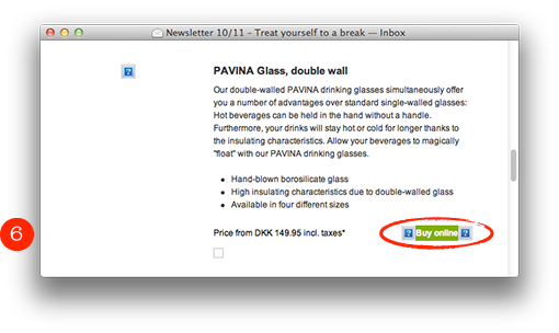
6. Note that the buy button isn’t a picture, so it’s visible even when the pictures are blocked. Well done! I’m sorry to say though, that they’ve forgotten the alt-texts for the product pictures.

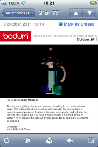
Unfortunately the product picture on the top of the page is inverted in an iPhone. I think they might have saved the picture in a wrong way. But apart from that the newsletter works well also here.

What is evident is that BODUM has missed out concerning the alt-texts and a better preheader. Otherwise everything is neat and clear. Four hearts out of five!

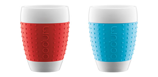
I bought these big tea mugs with rubbergrips in various colors. I do recommend them. They’re awesome!

Page 1 of 612345...»Last »


