All posts in ‘Communication’
Tuesday, 10 January 2012
If you don’t know the answer to this question maybe you should take a look in your subscriber list and figure it out. Next step is to consider how you can give your subscribers a possibility to register their new addresses and cancel the old ones. Then you don’t have to experience the ”hard bounces” – e-mails that ”bounce back” because the addresses don’t exist any more.
My new colleague Gun recently experienced what it means to change an e-mail address. She has several newsletters that she would like to keep, but she doesn’t remember all the newsletters she has subscribed to. So it would have been helpful if she’d been able to change address in the newsletters she received during the last month on her old job.
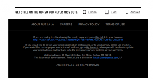
To check this out I looked at some of the newsletters I regularly receive in order to see if I easily could change my e-mail address – without having to unsubscribe and then subscribe with a new address. I did find one example, with a minimal text at the bottom of the page:

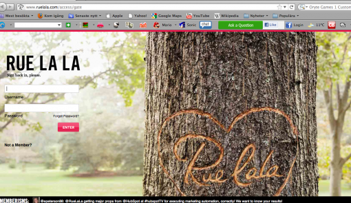
This is the footer of Rue la la and the grey text in the first paragraph tells you that you can visit ”My Pages” to change your address. Sorry to say but I was disappointed to be guided to the first page and there I had to fill in my log-in data – which I don’t remember.

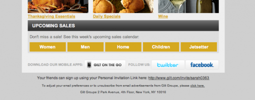
Gilt Group’s newsletter could have solved this much better … They started out so well. In their e-mail I am able to update my interests myself. (The text is extremely small!)

When I click on the suggested link I’m guided to a simple form. Wouldn’t it be nice if I could have changed my address there as well?

No, I don’t think that the desired function will have a dramatic effect on your sales or on the number of clicks or on the number of opened e-mails. But wouldn’t it be a nice thing to offer your customers? (Considering the amount of data that is stored on member sites!)
Anyway, we will add it in our newsletters for sure!
So how long is the life span of an e-mail address? About 2.4 years, they say. I’ve already mentioned that (and some more interesting figures) in this blog post.
Tuesday, 20 December 2011
When I shop online I want a certain amount of security concerning payments and delivery. I believe there are more people feeling like I do. One of my online orders was confirmed and I was told it was sent two weeks ago, but it hasn’t turned up yet! But now I got a link by e-mail so I could track the goods, which means that I now know it did move four days ago. Far from all e-retailers give their customers tracking links with their e-mail receipts.
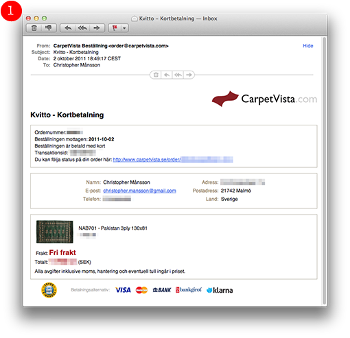
CarpetVista in Malmö, selling carpets online, inform their customers in a good way, though.
Apart from the detailed product information on their site, their e-mail confirmations are good and confidence-inspiring.
This is how they look:
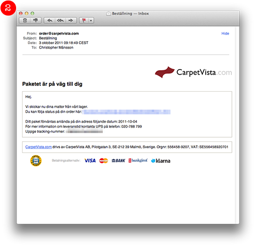
As soon as I paid my carpet there was a detailed receipt in my inbox.

The day after they sent the carpet and I received another e-mail telling me that my carpet was on its way. Attached was a link so I could track my package.

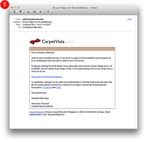
The following day UPS deliveed the carpet and the same day there was another e-mail with this piece of information:
Thanks for your order. You have now received your goods and we hope that you are perfectly satisfied with your carpets and with our service.
We constantly struggle to improve our customer service. Your points of view are extremely important to us and we would like to take the opportunity to ask a couple of questions. We would be very grateful if you would give us a few minutes of your time.

I think that the logistics of CarpetVista is very good and they make you aware of it by the use of e-mails. The buying process is secure and thorough.
Sunday, 13 November 2011
I recently wrote a blog post at I love e-commerce about a web shop’s bottom navigation. In almost all the examples I show the registration for a newsletter is placed at the bottom of the page. During all the years I’ve worked with e-mailing I have claimed that it’s best to put the registration button at the top of the page… But I’m not so sure any more, especially when it comes to e-commerce sites. Lena, my colleague, who is also the Mystery eShopper expert – she is testing e-commerce sites by acting like an ordinary customer – has shown me how important it can be to put valuable information at the bottom of the page.
Consider for a moment where you look for information that doesn’t belong to the actual product categories in a web shop. When you want to find information about customer service, share on Facebook, check in what city the company is situated – where do you look? That’s right, often at the bottom of the page. That’s why it’s a pretty good idea to put ”Sign up for our newsletter” right there.
Check this example:

It’s clear and neat. An icon and a button show what it’s all about. The design is fine without being overmuch.

This one is really spiffy, although the colors are quite dark which makes it a little difficult to find the register button. It’s placed at the bottom together with the categories.
Considering the footer itself I would recommend you to place the contact information as well as the categories there. If a great deal of the ”clicks” are there it might indicate that you haven’t given the kind of information the customers want and/or that they want some more information. So the statistics of the ”clicks” can help you making this right. If the majority of your customers click in the end of the newsletter for a certain category it might show that you should write more about that particular thing in the following newsletters. Here’s an example:

Below is an example of a footer from a restaurant showing where they’ve chosen to put information about opening hours and bookings. In addition they tell you about telephone number and the possibility to follow them on Twitter. It’s a good and informative newsletter where they also clearly tell the customers how much their meals are… Where do you think the customers look for the booking information? Of course, at the bottom of the newsletter.

Check your statistics! Isn’t it true that the fewest clicks are NOT at the bottom of the newsletters? And yet we often continue to put the least interesting information at the bottom…
Good luck with your ”feet”!
Sarah@@@@@
Sunday, 9 October 2011
In comparison to one of Sarah’s last posts, where she shows off snazzy examples of good alt-text usage, I’ll be showing off some examples that are not so flattering.
This newsletter made it’s appearance in my inbox recently, it comes from a large department store here in Malmö; I won’t be saying any names this time around. For this example, they’re lucky most email clients block images.
It’s not unheard of for us to go through email without an internet connection, and naturally, the images from a newsletter will pull a no show without one.
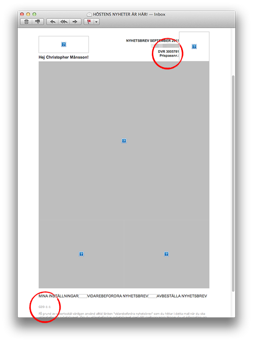
Here’s our newsletter example, without its WIFI-enhanced clothing:

Behold! A giant gray box, cute blue boxes therein and strange cryptic code scattered throughout.
In the header:
DVR 3005781
Prispassnr.:
In the footer:
G09-1-1
Does this code mean anything to me? Why do we communicate with our customers like this?
I don’t know how to break it to you, but, this is not good.
I think the problem is that many companies, oddly enough after 40 years, still do not understand that email is a communication channel. They see it solely as an advertising medium and believe that an attractive product image will do the job.
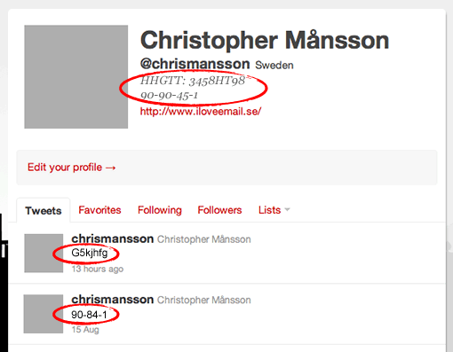
Allow me to exaggerate for the sake of a point. Check out my new Twitter profile below. I’ve updated my profile picture, and I’ll be tweeting irrelevant code from now on. I’m trying to get more followers.

Do you see my point?
Tuesday, 27 September 2011
If we make a deal or an agreement or maybe confirm some kind of trade … What is it we usually do in such a case? Well, we shake hands or in some other way confirm that we have a deal. But how often do we see this when it comes to confirmations of a subscription to a newsletter? Rarely, I’m sorry to say.
If customers share something that is dear to them – their email address – which means that the senders of the newsletter are able to get in touch with the customers whenever they like – wouldn’t it be appropriate to say thank you? And at the same time make it very clear what the deal is about. When I register to a newsletter I sooo often get the same message; something about that I’ve now been added to their list for newsletters. In the worst cases I’ve been told that I’m now on their ”customer list”. I’ve even been called a ”bronze customer”!
Below are some examples of good confirmations:

So, say ”Thank You” to a new reader and work a little with the design – that’s not too much to ask for, is it?
Here’s another one; they show a little humor, which makes them feel free to ask for a little more if the customer show some appreciation:

I do like the following example because it tells me once again what we agreed on (and then they ask for some more information):

Next one tells me how happy they are having a friend like me, they even drink a little(?) champagne – without me, it seems, but that’s all right!

So check out in what way you confirm a subscription or a membership – both as a message on the web and as a confirmation email. To say thank you and confirm an agreement is, in fact, just an ordinary courtesy – and I don’t give a damn about what your email provider thinks about it or what is the easiest for you. This is all about what is the easiest, the finest, and the nicest for your customers! Always priority no 1!
Sarah@@@@@
Page 2 of 7«12345...»Last »
