All posts in ‘E-mail Marketing’
Thursday, 12 July 2012
In the end of last month I visited Compost E-Mail Seminar. I really liked it because Compost is so focused on e-commerce and e-mailing. And they don’t concentrate only on newsletters, but on how the customers are taken care of – e.g. by various kinds of event controlled e-mails, often triggered by something the customer has done on the web for instance.
Compost’s work with e-commerce matches very much what I’m doing within the fields of e-mailing – and Mystery eShopper. When Lena and I work with the testing of e-commerce companies we see many different e-mails: e-mails confirming a purchase or a packaging/delivery of goods, evaluation e-mails, newsletters, customer service e-mails and many more. All these types of e-mailings give us a clear picture of how well the communication of a company is synchronized. This is what I lectured about on the Compost E-Mail Seminar, but I will write a little more about that some other time.
Here is a check list of the ingredients you should include in a confirmation e-mail. Be my guest!
- Remember to show that the customer has made a perfect choice by making a purchase from you.
- Write from a valid address. (Avoid a no-reply address!)
- Remind the customers of who you are in the subject line. Mention the purpose of the e-mail.
- Say thank you to your customer – regardless of the sum of his/her order.
- Forestall possible questions from your customers. Make sure that the answers are available in an easy way.
- Be short and precise, so that the customer gets an overview. Short sentences, preferably dot lists.
- Clear call-to-actions. What is the customer supposed to do next?
- Be personal, even if it’s on a simple level.
- Make your logo type clearly visible to increase a quick recognition factor (spammers often send e-mails looking like confirmation e-mails).
- Make sure that all kinds of information is included. Make returns and other changes simple.
- Show the customer that you appreciate the data he/she has given you and that you’ll use it to his/her advantage.
- Tell about the buying conditions – which will increase the customer’s sense of security (or show where this information is to be found in a clear and simple way).
- Clearly visible links to your home page.
- Write your newsletters in HTML, use pictures.
- Give your customers good and relevant offers – after you’ve given them something of value.
Good luck! Sarah@@@@@
Saturday, 7 July 2012
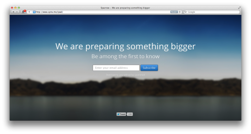
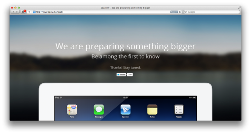
Here’s a neat example of how to get e-mail addresses for a certain purpose or for a specific campaign. In this case it’s the e-mail client Sparrow for iPad that is being marketed.
At first they entice you to register by not telling exactly what it’s about. But you will be among the first ones to be informed. Note that they write: ”Don´t worry, you will not be spammed”, just to ensure you that they take care about your e-mail address.

When you have registered, an iPad with an app appears – revealing something you really already knew.

Such a campaign is great fun, I think, it’s simple to implement, it’s cheap and it´s personal – ‘cause our e-mail address is still among the most personal things we have on the Internet.
Maybe something you should try?
Saturday, 30 June 2012
Have you also noticed that some newsletters, especially those not coming from Sweden, start with [MARKETING] in the headline? Twice I´ve been asked about it, so I decided to put the question to MailChimp and Campaign Monitor. Their e-mail tools are used worldwide and they are very obliging when it comes to answering questions.
The reasons why some newsletters use this ”sign” in the headline are these:
- In some regions, especially in the US, it´s either according to the law or is considered to be best practice – even appropriate – to use a prefix in the subject line.
- In China, for example, there is a law stating that you must write [ADV] in the subject line when it´s a question of marketing or advertising in the newsletter.
- In the US this ”sign” must mark any letter with an ”adult” content.
So should we start the headlines of our Scandinavian newsletters with [MARKETING] when they contain marketing? My personal stand point is: No. On the other hand I do think that we should be clear about informing our readers about the expected content – when they register. Why not let them read older newsletters as examples? And do tell them how often they can expect a newsletter from you.
I´ll soon be back and tell you my views on one vs. many letters. That will be a long post!
Sunday, 11 March 2012
Isn’t this a fine example of a ”We Miss You-Email”? This is indeed something we could send out trying to stimulate ”sleepy” subscribers.
Hey Sarah,
Look, there’s no easy way to say this, but we miss you.
We miss your smile, we miss the way you smell, we even miss the dumb jokes you used to tell.
We know it’s only been a few months… but to us it feels more like a few years.
We’ve got tons of new photo goodies you’d love. Stuff you always dreamed of. Wanna check it out? (No pressure!) Here’s a $5 GIFT CODE for your next order. (Good today and tomorrow only, NO MINIMUM ORDER!)
Gift code: _______
Visit: http://photojojo.com/store/email
Hope to see you soon!
Wistfully,
Your pals at The Photojojo Store
p.s. The gift code’s only good today and tomorrow, but feel free to pass it on to a friend if you can’t use it!
p.p.s. If you don’t want to receive emails like this anymore, please visit _____
If nothing happens after such an e-mail I think you should erase the subscriber from your list. There´s nothing to be gained from having a lot of inactive e-mail addresses.
Monday, 9 January 2012
When you design a newsletter for a mobile phone there are somewhat different demands to consider; nor are the thoughts about attracting the readers exactly the same. When reading a message of some kind in a mobile phone one doesn’t want it to be too long. You also need to make the buttons larger so it’s easy to click on them. Several companies at shop.org (an e-retailers’ gathering in Boston) told about how their readers use more time when reading a newsletter in an iPad or in a lap top than in a mobile phone. On the other hand, in mobile phones it seems as if the readers quicker continue to the home page, the blog, or whatever it is.
Can you see where your customers read your newsletters? How many of them read them in an iPhone or in an Android? If there is a large part of your readers using mobile devices you should put some resources into the design.
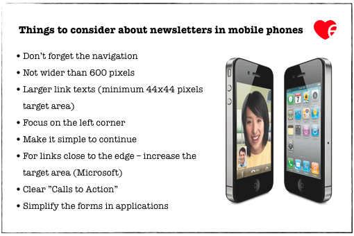
Here are some advice and tips in case you feel this is something you ought to look into:

The navigation needs to be simple because several choices make the texts very small. A simple bottom navigation might help you to see how readers who briefly check the content and – since they miss what they are looking for – in this way go on via the bottom navigation to your homepage.
Our newsletters are in 540 and 560 pixels. It’s absolutely okay to have quite narrow letters if you just consider the structure. Doing this is well spent time since you can give more people the opportunity to see the link texts or other important information at the left side.
Some companies that I’ve seen are asking for e-mail addresses for their subscription lists in applications. Don’t ask too much in an application. Filling in long forms is neither tempting nor easy when the space is so limited.
Those were some tips I hope you’ll find useful.
One last thing: To all e-mail service providers – I can’t tell you how many questions we get right now about how to choose the right e-mail tool. A lot of companies are really disappointed in their present provider. So pull yourselves together folks! Otherwise I might start blogging about things your customers tell me about! Take care of your customers, pamper them, and help them with their e-mail marketing on a long term basis. Everyone will profit from that!
Sarah@@@@@
Page 1 of 712345...»Last »

