Thursday, 21 July 2011, 11:37 AM
Catharina Östlund of Wilma&friends asked me on Twitter if I wanted to have a look at their newsletter and comment on it. And of course, I was happy to do so!
So me and Christopher have studied it and Catharina generously allowed us to write a blog post on the subject.
This is how the newsletter looks:

I think you’ll agree with me when I say that the letter is pretty good-looking. It’s airy, simple, and well thought-out. The design and the structure reminds us of their web site. Both Christopher and myself are in full agreement about the fact that Catharina has implemented many things that we seldom see in a newsletter.
These are our comments to Catharina:
- A well-structured letter. The readers get a good overview and can therefore quickly find what is interesting for them.
- Maybe you should shorten the sub-heading. (The Opening of Our New Web – New Design – New Functions – New Brands! Help Us Celebrate!) In quite a few email clients that sentence will be cut, since it’s too long. Not more than 49 characters (blanks included) if you want to feel sure.
- Try to be more personal and substantial in the headline. You often feel more secure when you’re broad and general, but it might – on the other hand – cause a lot of readers to loose interest. Suggestion for a headline: ”Tea Towels from Ferm – Free Shipping”. (We are well aware of the fact that neither Christopher nor me are good at writing apt headlines for a business we don’t know very well, but hopefully the principle is clear!) Be accurate and personal in all headlines AND in the text of the newsletter.
- Maybe you should move some of the text a little further up considering those who have blocked pictures. You’re given more chances of whetting the appetite of those who scroll down the page.
- Add a pre-header.
- Translate the footer into Swedish.
- Add the personal signature at the very bottom of your website to your newsletter.
- It might be a good idea to add more elements from your website to your newsletter. For instance:
- The same olive-green color also in the newsletter (as on the website).
- Olive-green or pink headlines, the same as on the website.
- Black, underlined links in bold – as on the website.
Catharina does the same as we do: She uses MailChimp’s tool for free since we still haven’t reached that many email subscribers yet. The logotype at the very bottom of the newsletter is a must since MailChimp is so kind to let you use their tool free of charge. And so far we haven’t experienced any negative attention at all because of that. One thing we find really nice about it is that MailChimp lets you choose a little regarding the look of their logotype; they have a few various looks to choose from. And if you want another color – well, that’s also possible. Really nice, isn’t it?
So, Catharina, you have a very handsome newsletter. We’re so happy that we had the opportunity to study it and thank you for letting all our readers share your letter and our suggestions. We like!
Since the things we wanted to change were minor ones and we feel that Catharina’s thinking here is absolutely right, I’ll give her 4 hearts out of 5.
If your curiosity is aroused – then you’ll find Catharina’s blog here.
Monday, 18 July 2011, 12:08 PM

Here’s a little hint for all those who are coding manually in HTML. There’s a basic template you can start from here. It will certainly solve the most common problems you’ll come across; and in the most common email clients too.
htmlemailboilerplate.com
Thursday, 14 July 2011, 10:40 PM
Not only Amazon (which I told you about in my last post) but also Ebay uses my web history. They send emails with a list where they specify what I looked at last time and they ask me if I’m still interested in these articles.
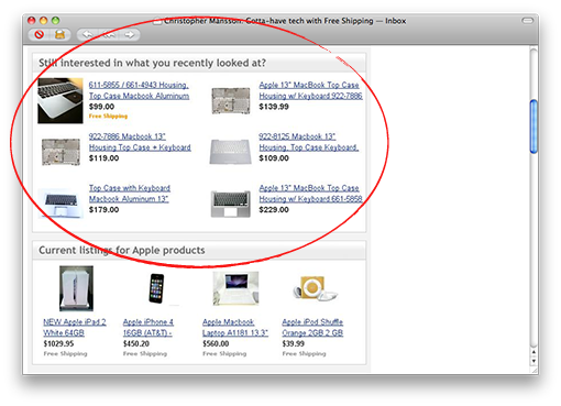
In this case I had checked out a keyboard to my MacBook.
An interesting detail is that their emails are dynamically built. In the encircled area in the email above the products change every time I close and open the email – the same email, mind you. It’s not very common to see dynamical content in an email, especially where it’s used in such an intelligent way. Ebay really uses this cleverly. The disadvantage here is – I have to say – that everything is laid out as big pictures.
Ebay’s individually adjusted emails get three hearts out of five from me.

Tuesday, 12 July 2011, 12:19 PM
Have you ever experienced going to your local shop to buy butter – and returning home with everything except butter? I do that all the time. My head is full of thoughts, mostly thoughts about my job – seldom about butter.
That’s why I buy a lot of small things like screw drivers, for example, in web shops. It’s so easy to visit Amazon and click on the buy button as soon as I remember I need a screw driver. If I don’t do that I keep forgetting and what is broken remains broken for months.
Sometimes I even forget about the screw driver I’m about to click on if the phone rings or I get an important email. Anyhow, I shop a lot from Amazon.
When the above did happen, one day passed and an email from Amazon landed in my inbox. That screw driver I checked out, but forgot about, is the very first thing they offer!
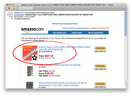
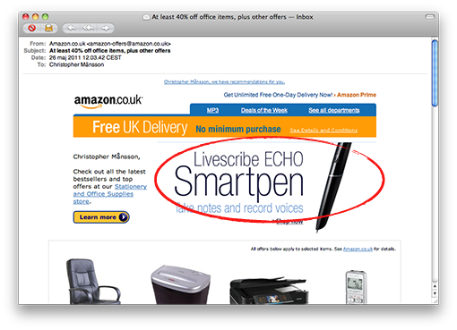
I had had problems with finding good pens for some time, so I remember that I took the opportunity to search for pens at the same time. And yes, next time I visited Amazon there was a new offer: ”A livescribe echo Smartpen”!
There are many reasons why Amazon is a successful company. Do you by any chance believe that individually adjusted e-commerce is one of them?
Amazon ”remembered” what I was interested in last time I visited, they know how I want to pay and in what way I want my goods delivered. One click for one buy is everything they ask from me when I have put an article in my cart. And if I don’t click on the buy button, they remind me in their next email.
Listen and learn, e-retailers!
The individually adjusted emails from Amazon get four hearts!

Monday, 11 July 2011, 7:44 PM
I’ve so many times had to copy a link to an article or a funny clip in order to send it to a friend. I usually don’t want to show everybody everything I read or see and sometimes I will make sure that some special friend really reads my tip.
Facebook has – of course – understood this. I’d like to show you what me and Christopher discovered some time ago. We were reading this page and noticed a little blue send button:

Can you see the ”Send”-button between ”Like” and ”Tweet”? When you click on that button you can email a particular person – or several ones. Also you can mail a group on Facebook, something I will use a lot.

So, how does it look when it reaches the recipient? Well, take a look!

The fact is that you get a higher completion rate when you tip a specific friend than when you tip all your friends on Facebook. So use this refinement with finesse and check out the possibilities it offers. This is absolutely something you should add.
And yes – this is definitely something that offers enormous possibilities of marketing. But don’t forget: What you are able to do and what you should do is not the same in this case.
Page 10 of 25« First«...89101112...20...»Last »


