Monday, 21 November 2011, 12:47 AM
Hopingly you all know that we regularly produce a newsletter. Being e-mail nerds, Sarah and I code our newsletters ourselves.
But there’s always something that malfunctions – and last time it was Hotmail.
We have a big background picture which, in fact, works in most e-mails clients: Mac, Gmail, Hotmail, Outlook for PC a.s.o.
You fix a background that works almost everywhere by specifying the back ground picture twice in the coding. Once in ”BODY” and once in an enclosing html-table.
This is how you do it in ”BODY”:
<body background=”http://www.nordicecommerceknowledge.se/ebrev/ebrev-bg1.jpg”>
And in the enclosing html-table:
<table width=”100%” cellpadding=”0″ cellspacing=”0″ border=”0″ align=”center” background=”http://www.nordicecommerceknowledge.se/ebrev/ebrev-bg1.jpg”>
But – it was cut off in Hotmail. The problem with Hotmail is that it only does the background, regardless if it’s a background picture or a background color, as wide as the content is wide. This results in two things: white spaces in the margins and the newsletter is aligned left. Not very trim…
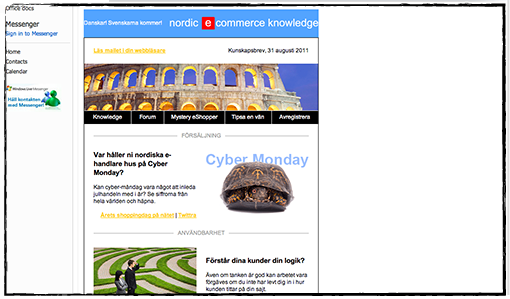
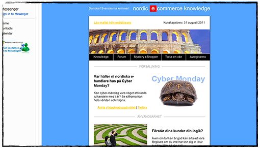
After seven attempts we finally got it right. You have to overwrite Hotmail’s rules for content viewing – which is done with a little CSS-coding at the top of the mail.
Like this:
<style type=”text/css”>
.ReadMsgBody
{width:100%;}
.ExternalClass
{width:100%;}
</style>
Now, see the difference and how nicely the background is showing:
If you want our (Swedish) newsletter you are welcome to register for it at this address:
www.nordicecommerceknowledge.se
Sunday, 13 November 2011, 1:34 PM
I recently wrote a blog post at I love e-commerce about a web shop’s bottom navigation. In almost all the examples I show the registration for a newsletter is placed at the bottom of the page. During all the years I’ve worked with e-mailing I have claimed that it’s best to put the registration button at the top of the page… But I’m not so sure any more, especially when it comes to e-commerce sites. Lena, my colleague, who is also the Mystery eShopper expert – she is testing e-commerce sites by acting like an ordinary customer – has shown me how important it can be to put valuable information at the bottom of the page.
Consider for a moment where you look for information that doesn’t belong to the actual product categories in a web shop. When you want to find information about customer service, share on Facebook, check in what city the company is situated – where do you look? That’s right, often at the bottom of the page. That’s why it’s a pretty good idea to put ”Sign up for our newsletter” right there.
Check this example:

It’s clear and neat. An icon and a button show what it’s all about. The design is fine without being overmuch.

This one is really spiffy, although the colors are quite dark which makes it a little difficult to find the register button. It’s placed at the bottom together with the categories.
Considering the footer itself I would recommend you to place the contact information as well as the categories there. If a great deal of the ”clicks” are there it might indicate that you haven’t given the kind of information the customers want and/or that they want some more information. So the statistics of the ”clicks” can help you making this right. If the majority of your customers click in the end of the newsletter for a certain category it might show that you should write more about that particular thing in the following newsletters. Here’s an example:

Below is an example of a footer from a restaurant showing where they’ve chosen to put information about opening hours and bookings. In addition they tell you about telephone number and the possibility to follow them on Twitter. It’s a good and informative newsletter where they also clearly tell the customers how much their meals are… Where do you think the customers look for the booking information? Of course, at the bottom of the newsletter.

Check your statistics! Isn’t it true that the fewest clicks are NOT at the bottom of the newsletters? And yet we often continue to put the least interesting information at the bottom…
Good luck with your ”feet”!
Sarah@@@@@
Tuesday, 1 November 2011, 8:27 AM
E-mails are alive and kickin’!
Statistics can be used in many different ways – sometimes in a wrong way too – but now and then we might learn a whole lot. Often the figures are so enormous that we have difficulties in understanding them. What do you say about this: During one day – just one day – we send many more than 300,000,000,000 e-mails!
Visit this site and you’ll see some other fantastic statistics as well:
www.worldometers.info
Notice that the population of this world has now reached more than 7 billion people. Yesterday evening, in fact! (As late as in 1999 we passed 6 billion people. So it’s moving on, isn’t it?)
Monday, 31 October 2011, 12:55 AM
Now after almost 400 blog posts we’ve looked back and tried to figure out what we have neglected lately. The E-Mail Gallery, for example.
So here is an updated selection of examples of good newsletters. But you can always find them to the right as well.
If you’ve found a newsletter you want to show us – please feel free to send us a hint about it.
Wednesday, 26 October 2011, 9:08 PM
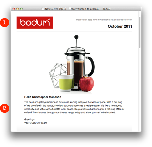
The Danish family company BODUM presents this neat and simple newsletter:
1. A clean header with a clear sender.
2. A fine product picture with a personal greeting. It’s important to say hello to the subscriber before you try to sell something. It’s like in “real” life: You do greet the customer before you present your products or services, don’t you? Not everybody likes to have offers thrown into their faces, just like that…

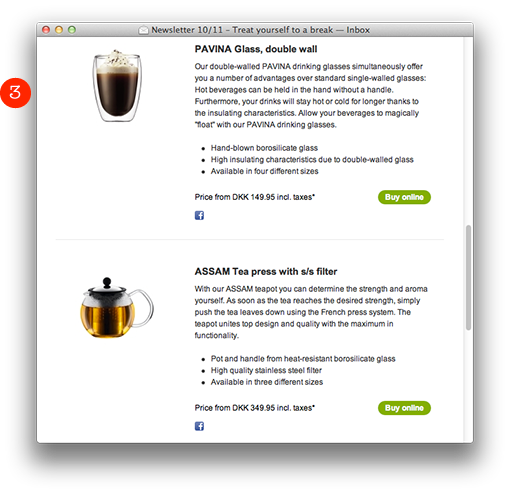
3. They briefly list their products with a clear product picture, an informative text, price, and a distinct green “Buy online”-button to the right which brings you directly to their web shop.

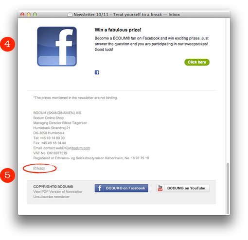
4. Sweepstakes work well in newsletters. In this case BODUM links to the sweepstakes on Facebook. Sarah and myself have seen unusually high activities in newsletters where they emphasize various possibilities to win prizes.
5. An informative footer with links to the channels on YouTube and Facebook. Also notice the little link “Privacy”. If you click there you end up on a page where you’ll find this text:
Any personal information gathered by us will be used solely for the purpose of order processing. We will not sell, traffic or hire out your personal data to third parties.
We like!

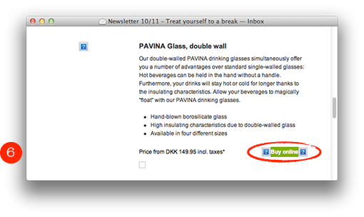
6. Note that the buy button isn’t a picture, so it’s visible even when the pictures are blocked. Well done! I’m sorry to say though, that they’ve forgotten the alt-texts for the product pictures.

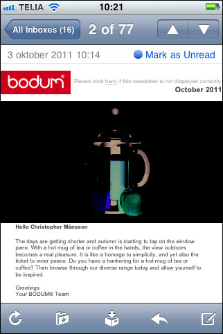
Unfortunately the product picture on the top of the page is inverted in an iPhone. I think they might have saved the picture in a wrong way. But apart from that the newsletter works well also here.

What is evident is that BODUM has missed out concerning the alt-texts and a better preheader. Otherwise everything is neat and clear. Four hearts out of five!

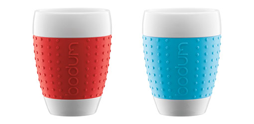
I bought these big tea mugs with rubbergrips in various colors. I do recommend them. They’re awesome!

Page 6 of 25« First«...45678...20...»Last »


 Bodum
Bodum Raymond Weil
 Wilma & Friends
 Vasette Gazette