Monday, 6 February 2012, 11:05 AM
This is a dangerous question to answer in printing, right? I might be wrong about it and it might be held against me one day. Anyway, I have thought about it a great deal and, daring as I am, I will reveal my conclusions about e-mailing in the future.
Social media have an influence on e-mailing
A great deal of the changes we are about to experience are due to the influence that social media have on our possibilities to communicate in whatever way we prefer. People working with marketing often talk about choosing the right channel for a particular target group. This sounds easy, but it isn’t – far from it! I’m really disturbed over the fact that we haven’t reached further. Our desire isn’t primarily to send a text message or to send an e-mail or to chat – no, the desire is to COMMUNICATE! So when will we marketers start talking about communication rather than channel? We’re occupied with measuring and analyzing every channel to know what to go for. What Facebook is teaching us through their new communication system is that the user is offered many various ways of communication and that it’s for the users to choose. Words that are defining the new way of thinking are: seamless, informal, immediate, personal, simple, minimal, short.
Don’t get stuck in a certain channel (and what if e-mail is going to die?) – instead: consider what you want to communicate.
Mark Zuckerberg said this (when he introduced the new communication system on Facebook):

This is not an email killer. This is a messaging system that includes email as one part of it.
Apple, Facebook, and Klarna are examples of companies chipping in a lot of resources into making their services and products as smooth and lean as possible for the users. The e-mailing world must do the same. When it comes to the choosing of an e-mail service provider, the one who works with the tool and creates the newsletters must have a say about how well it works for him or her.
If it appears that the system goes down now and then: cut! Considering what I said before about the fact that we want a simple and quick way of communication, your e-mail tool must have the capacity to send out letters promptly – and maybe even unscheduled.
So check all your processes and how they are understood by your subscribers. For example:
- The registration process must be clear and simple.
- The information about your customers must be controlled by themselves; make it simple for them to change any data.
- Make it evident for your company what has been changed and act accordingly.
We’ve ”preached” a lot about e-mailing – but do all our hints still work? You have to check that! Maybe we should have another headline? (Think twitter!) When we think Facebook – maybe sheer text mails will come back? Consider these things, make some tests, and be open minded. Always mind your target groups!
The smart phones change a lot of things for us!
So here I am, joining the crowd that nag about the smart phones changing everything and that it’s time for action about this. Earlier the day, and even the hour, for sending a newsletter was extremely important. This was because we wanted the newsletter to hit the inbox when the subscriber is at his/her computer ready for a little reading. But with the smart phones this will probably change in some way. Now we’ve got the inbox with us all the time – even beside our beds. I’m not saying that the timing isn’t important anymore, but rather that this is changing and that we must be aware that so many people are reading their newsletters in their smart phones and we must learn how they react when they do so. And we just have to adjust the newsletters to that little screen. An example: You click on something (a slow connection too) and because of the small size you clicked on the wrong link … Isn’t it enervating?

The subscriber decides what is SPAM, not Google.
So many people have been raging over the Gmail Priority Inbox. They mean that maybe the newsletters don’t land in the best inbox or maybe are considered to be spam or are shown further down on the important list over all the e-mails in the readers’ inbox. All of which would be a catastrophe. Forget it! This has been way too exaggerated.
Facebook has shown us that it’s the user who decides to ”like” you or to accept you as a friend – and then you are able to communicate with this person in whatever way you prefer. BUT you must deserve trust and you must take care of that trust. So here we are again – the most important as far as e-mailing is concerned: you must show that you deserve to own that e-mail address and you mustn’t misuse that trust. If you already are working according to this you won’t have any problems with it in the future either.
I may be wrong about one or several points here – but if I’m not: It’s always good to be prepared and start thinking about what the future is offering you and your customers.
Sarah@@@@@
Thursday, 26 January 2012, 6:41 PM
ThinkGeek’s online shop – which I describe in short at I love e-commerce – also has a newsletter and it turned up in my inbox on Cyber Monday – of course.

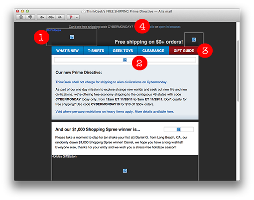
1. This is what the newsletter looks like when the pictures are blocked. There are alt-texts in all the pictures so we can understand what they contain and the picture sizes are mentioned in most cases.
2. The height of the big picture at the top isn’t stated though. The result is that this particular picture, which is very big, is comprised to a narrow string, so the first text paragraph lands high up. The reader is thus able to read the text without having to scroll the page. So the people who’ve coded this newsletter are evidently skillful and know how to do this.
3. The buttons atop are made in text and not in pictures, which otherwise is quite commonly done. Text buttons are always clear and visible. It’s not easy to make text buttons clear and trim in e-mail clients, but in this case they have really succeeded.
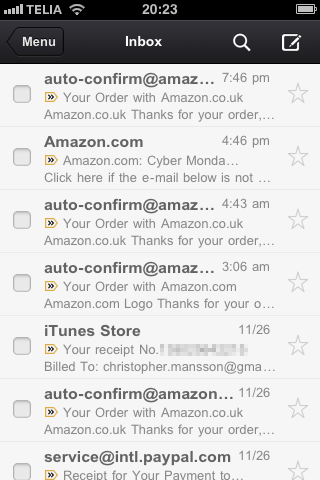
4. They have squeezed in the reduction code ”Cybermonday” in the preheader also, which you can see in the inbox together with the subject line – they combine the subject line and the preheader in this newsletter. The preheader is like an answer to the subject line. Good!

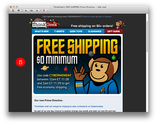
5. This is a good-looking letter with fun and catching graphics. It’s easily noticed when people work a little extra and make their own graphics instead of buying pictures; it makes the newsletter much more interesting and enticing. The monkey also turns up on their site when you want to ask for help. They have built up a clear theme around this monkey – whose name is Timmy – and you immediately recognize the company because of Timmy in combination with the ”geeky” graphics.

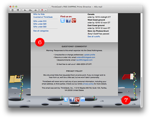
6. They also have a fantastic footer with quick links to various product categories on their site and also contact information out of the ordinary. Apart from telephone numbers and information about where to turn concerning orders, they ask the customer to get in touch with them with comments and ideas. Finally they tell the customers that their data are safe with the company and will never leave ThinkGeek.
The content of the newsletter contains offers, but also prize competitions (the winners are presented in the newsletters too). A good way of giving the customers a sense of engagement.
7. The interesting background picture is made so that it ”disappears” in a nice way without disturbing the look of the newsletter in, for instance, Gmail and other webmail clients where it doesn’t work.

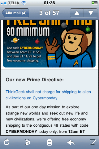
The newsletter works perfectly well in a smart phone too. The text is big enough and very clear, so I need not to zoom in to be able to read the text.
Sunday, 22 January 2012, 10:44 PM
The Gmail app is available in iTunes Store.
Personally I feel that the app is a little inflexible and complicated, but if you want a separate e-mail application for Gmail not having to mix it with, for instance, company e-mails or other e-mails in Apple’s Mail Application – then the Gmail app is pretty useful.
Gmail for iPad:

Gmail for iPhone:

Tuesday, 10 January 2012, 8:14 PM
If you don’t know the answer to this question maybe you should take a look in your subscriber list and figure it out. Next step is to consider how you can give your subscribers a possibility to register their new addresses and cancel the old ones. Then you don’t have to experience the ”hard bounces” – e-mails that ”bounce back” because the addresses don’t exist any more.
My new colleague Gun recently experienced what it means to change an e-mail address. She has several newsletters that she would like to keep, but she doesn’t remember all the newsletters she has subscribed to. So it would have been helpful if she’d been able to change address in the newsletters she received during the last month on her old job.
To check this out I looked at some of the newsletters I regularly receive in order to see if I easily could change my e-mail address – without having to unsubscribe and then subscribe with a new address. I did find one example, with a minimal text at the bottom of the page:

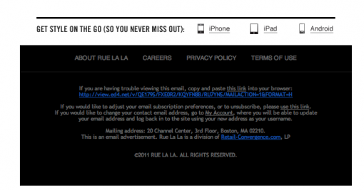
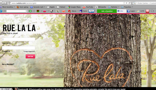
This is the footer of Rue la la and the grey text in the first paragraph tells you that you can visit ”My Pages” to change your address. Sorry to say but I was disappointed to be guided to the first page and there I had to fill in my log-in data – which I don’t remember.

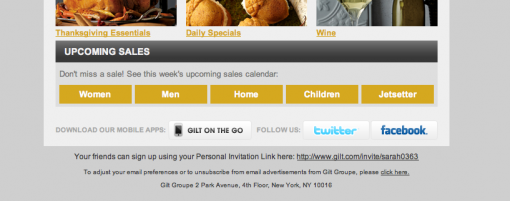
Gilt Group’s newsletter could have solved this much better … They started out so well. In their e-mail I am able to update my interests myself. (The text is extremely small!)

When I click on the suggested link I’m guided to a simple form. Wouldn’t it be nice if I could have changed my address there as well?

No, I don’t think that the desired function will have a dramatic effect on your sales or on the number of clicks or on the number of opened e-mails. But wouldn’t it be a nice thing to offer your customers? (Considering the amount of data that is stored on member sites!)
Anyway, we will add it in our newsletters for sure!
So how long is the life span of an e-mail address? About 2.4 years, they say. I’ve already mentioned that (and some more interesting figures) in this blog post.
Monday, 9 January 2012, 9:39 AM
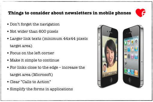
When you design a newsletter for a mobile phone there are somewhat different demands to consider; nor are the thoughts about attracting the readers exactly the same. When reading a message of some kind in a mobile phone one doesn’t want it to be too long. You also need to make the buttons larger so it’s easy to click on them. Several companies at shop.org (an e-retailers’ gathering in Boston) told about how their readers use more time when reading a newsletter in an iPad or in a lap top than in a mobile phone. On the other hand, in mobile phones it seems as if the readers quicker continue to the home page, the blog, or whatever it is.
Can you see where your customers read your newsletters? How many of them read them in an iPhone or in an Android? If there is a large part of your readers using mobile devices you should put some resources into the design.
Here are some advice and tips in case you feel this is something you ought to look into:

The navigation needs to be simple because several choices make the texts very small. A simple bottom navigation might help you to see how readers who briefly check the content and – since they miss what they are looking for – in this way go on via the bottom navigation to your homepage.
Our newsletters are in 540 and 560 pixels. It’s absolutely okay to have quite narrow letters if you just consider the structure. Doing this is well spent time since you can give more people the opportunity to see the link texts or other important information at the left side.
Some companies that I’ve seen are asking for e-mail addresses for their subscription lists in applications. Don’t ask too much in an application. Filling in long forms is neither tempting nor easy when the space is so limited.
Those were some tips I hope you’ll find useful.
One last thing: To all e-mail service providers – I can’t tell you how many questions we get right now about how to choose the right e-mail tool. A lot of companies are really disappointed in their present provider. So pull yourselves together folks! Otherwise I might start blogging about things your customers tell me about! Take care of your customers, pamper them, and help them with their e-mail marketing on a long term basis. Everyone will profit from that!
Sarah@@@@@


