Thursday, 20 December 2012, 11:47 PM
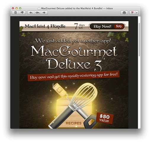
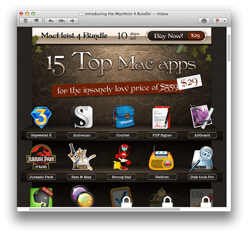
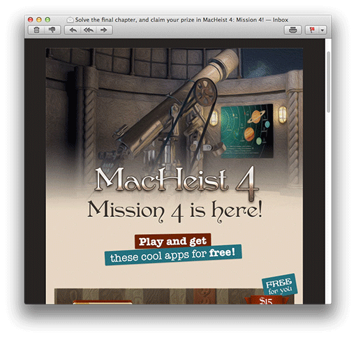
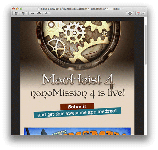
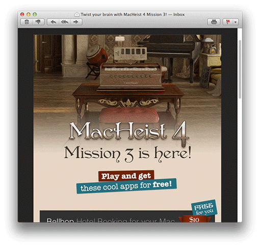
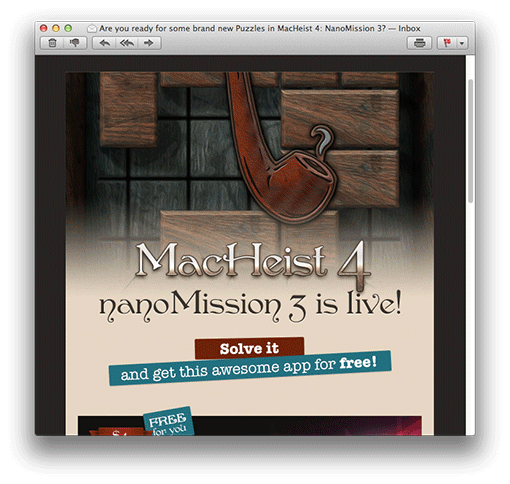
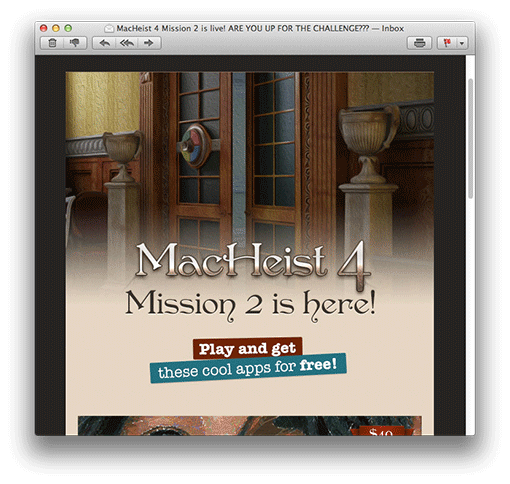
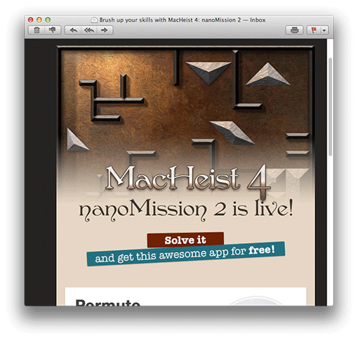
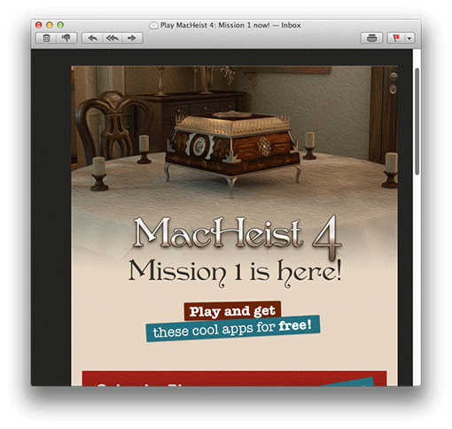
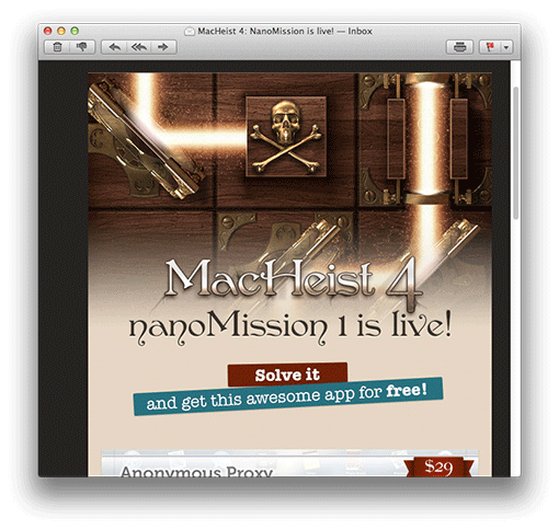
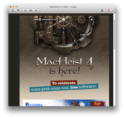
MacHeist has done it again – the best e-mail campaign!
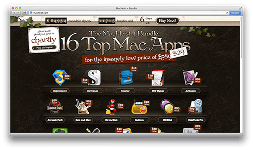
What they do is to gather a bunch of applications, pack them in an attractive way and sell them at a heavily reduced price during a limited time. For 29 dollars your’re offered applications worth 589 dollars (and 25 % of what you pay goes to charity)!
They implement this with the help of gamification and a neat, pretty aggressive e-mail campaign consisting of many e-mail – but the again: you do get a lot for free. Up until the day the package is available you’re asked to solve riddles and problems, and in this way you get applications for free.
In every e-mail there’s something of value for you.
You may look for a neater and more well-made campaign – but you won’t find one!
Check these e-mails and be inspired!


The e-mails above seem to be one single big picture – which wouldn’t have been such a great idea since most e-mail clients block pictures – but that is not the case.
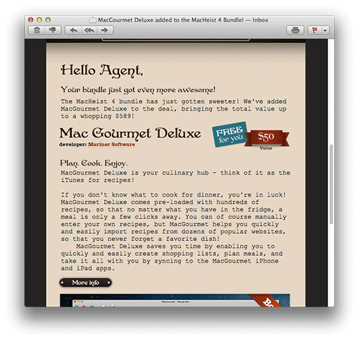
If you scroll the e-mail you’ll find interesting messages too:

When you visit the web page you’ll find the same neat design:

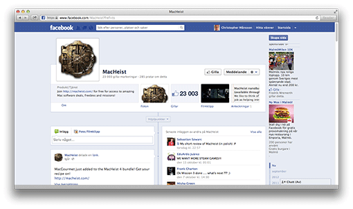
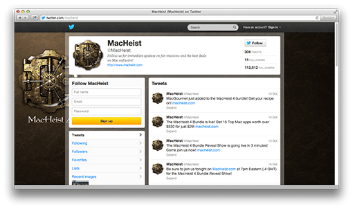
And simultaneously you’ll find the same campaign on Facebook and Twitter – of course.


With this campaign MacHeist enhance the customers’ interest and give value during a long time before the offer itself turns up. They keep their subscribers engaged and curious. With the help of gamification it becomes a little game and a digital adventure.
Thursday, 20 December 2012, 11:43 PM
The advancement of ASOS in the Nordic countries is much admired. And when I check the e-mails I get from them I can see that they continuously are testing and evaluating the responses they get from their various e-mails and newsletters. In this blog post I’d like to show you some of the tests they do concerning subject line or title. If you want to know how to form a good subject line – maybe ASOS can inspire you.
I will also show you something that I personally like a lot. Despite ASOS’ focus on sales they do vary their e-mails; sometimes ”e-mails for selling”, sometimes ”e-mails for value”. When they give their customers something of value they can probably expect to sell even more in the following newsletters. You can call it bartering. ASOS gives the customers value and then ASOS can expect that they’ll buy something from them later on.
I am registered by two addresses with ASOS and I’m happy to have two different examples of the same e-mail every time. Otherwise I wouldn’t have discovered this. Look at these two e-mails: The same e-mail, but the introductions are a little different.

In this case they choose to have the very first words identical, but in the first one they add something to see if they will get more customers to open the e-mail. What about the rest of the letter? The headlines in the newsletter aren’t the same as in the subject line of the preview pane.

And the second one:

Another example:

In the second example above they are testing the effect of being a little provocative. I think that’ll work quite well in some countries. But I think I would be somewhat careful using ”Hey hot stuff!” I think about spam filters. The same goes for the word ”Game”. Though in this case it worked since it landed in my inbox. This time the two varieties had the same head title.

I also noticed that in several e-mails the top of the newsletter and the first offer were identical, but after that the offers were different, or the pictures and the title were different – but the offer was the same. Obviously they did this for the sake of testing what was more attractive to the recipients further down in the letter. Here is an example of that same e-mail, but with a different layout of the same content.

The other alternative:

So it is possible to put together the same content, but vary the look of the offer to see what works best OR to have exactly the same content, but try out the order of the content. I sure would like to work more with this when you e-mail service providers give us a SIMPLE function to use 🙂
Last, but definitely not least: In what ways do ASOS vary their messages in the different newsletters and e-mails? Well, it’s a lot about selling – but they blend in letters of value also. I know there are a lot of e-commerce people out there who claim that it’s only sales messages that are worth while … Yes, I know you feel that way. But in order to keep more than 25 % of your customers shopping you have to vary content more, especially if you don’t personalize your newsletters. If you follow my advice you’ll see a long lasting effect – and I’m sure you would like to give your dear subscribers a value now and then instead of always be nagging about selling.

See what I mean? Sales, sales, VALUE, sales, sales, sales, VALUE, sales a.s.o.
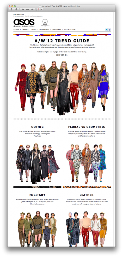
One of their ”value-emails” looked like this:

And look how they structure the newsletter and make it easier for their readers to find suitable category – and how well it’s adapted for portable reading devices, too. Nothing about selling, just a guide to find the right clothes. Do you think I shop from ASOS? You bet I do!
Thursday, 6 September 2012, 4:35 PM
Interesting reading – Dave Pell’s thoughts on e-mailing:
NextDraft’s Dave Pell on why email is still the killer app
Thanks to Ari Ahokas for the tip!
Thursday, 6 September 2012, 4:32 PM

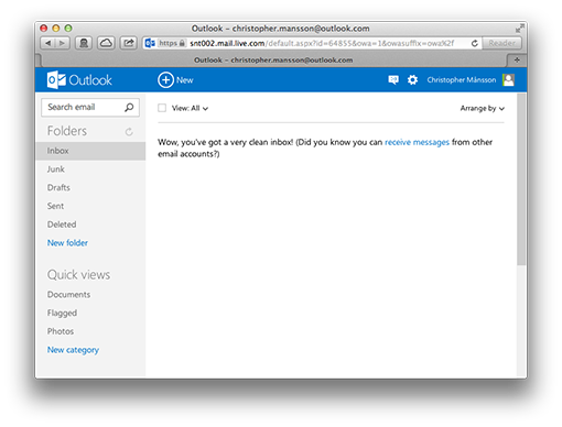
I like it!
It’s clear, simple, and it’s focused on your e-mail. You can log in with your existing Hotmail account – if you have one.
Here’s the new Outlook.com.
I think Microsoft is on the right track with this new and stripped design. Rounded corners, shadings and glass reflecting lights – the time for those things is over!
Thursday, 12 July 2012, 1:11 PM
In the end of last month I visited Compost E-Mail Seminar. I really liked it because Compost is so focused on e-commerce and e-mailing. And they don’t concentrate only on newsletters, but on how the customers are taken care of – e.g. by various kinds of event controlled e-mails, often triggered by something the customer has done on the web for instance.
Compost’s work with e-commerce matches very much what I’m doing within the fields of e-mailing – and Mystery eShopper. When Lena and I work with the testing of e-commerce companies we see many different e-mails: e-mails confirming a purchase or a packaging/delivery of goods, evaluation e-mails, newsletters, customer service e-mails and many more. All these types of e-mailings give us a clear picture of how well the communication of a company is synchronized. This is what I lectured about on the Compost E-Mail Seminar, but I will write a little more about that some other time.
Here is a check list of the ingredients you should include in a confirmation e-mail. Be my guest!
- Remember to show that the customer has made a perfect choice by making a purchase from you.
- Write from a valid address. (Avoid a no-reply address!)
- Remind the customers of who you are in the subject line. Mention the purpose of the e-mail.
- Say thank you to your customer – regardless of the sum of his/her order.
- Forestall possible questions from your customers. Make sure that the answers are available in an easy way.
- Be short and precise, so that the customer gets an overview. Short sentences, preferably dot lists.
- Clear call-to-actions. What is the customer supposed to do next?
- Be personal, even if it’s on a simple level.
- Make your logo type clearly visible to increase a quick recognition factor (spammers often send e-mails looking like confirmation e-mails).
- Make sure that all kinds of information is included. Make returns and other changes simple.
- Show the customer that you appreciate the data he/she has given you and that you’ll use it to his/her advantage.
- Tell about the buying conditions – which will increase the customer’s sense of security (or show where this information is to be found in a clear and simple way).
- Clearly visible links to your home page.
- Write your newsletters in HTML, use pictures.
- Give your customers good and relevant offers – after you’ve given them something of value.
Good luck! Sarah@@@@@
Page 1 of 2512345...1020...»Last »
