Sunday, 9 October 2011, 11:21 PM
In comparison to one of Sarah’s last posts, where she shows off snazzy examples of good alt-text usage, I’ll be showing off some examples that are not so flattering.
This newsletter made it’s appearance in my inbox recently, it comes from a large department store here in Malmö; I won’t be saying any names this time around. For this example, they’re lucky most email clients block images.
It’s not unheard of for us to go through email without an internet connection, and naturally, the images from a newsletter will pull a no show without one.
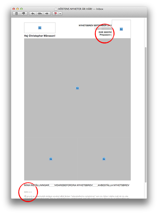
Here’s our newsletter example, without its WIFI-enhanced clothing:

Behold! A giant gray box, cute blue boxes therein and strange cryptic code scattered throughout.
In the header:
DVR 3005781
Prispassnr.:
In the footer:
G09-1-1
Does this code mean anything to me? Why do we communicate with our customers like this?
I don’t know how to break it to you, but, this is not good.
I think the problem is that many companies, oddly enough after 40 years, still do not understand that email is a communication channel. They see it solely as an advertising medium and believe that an attractive product image will do the job.
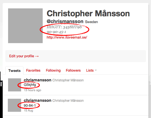
Allow me to exaggerate for the sake of a point. Check out my new Twitter profile below. I’ve updated my profile picture, and I’ll be tweeting irrelevant code from now on. I’m trying to get more followers.

Do you see my point?
Tuesday, 27 September 2011, 12:48 PM
If we make a deal or an agreement or maybe confirm some kind of trade … What is it we usually do in such a case? Well, we shake hands or in some other way confirm that we have a deal. But how often do we see this when it comes to confirmations of a subscription to a newsletter? Rarely, I’m sorry to say.
If customers share something that is dear to them – their email address – which means that the senders of the newsletter are able to get in touch with the customers whenever they like – wouldn’t it be appropriate to say thank you? And at the same time make it very clear what the deal is about. When I register to a newsletter I sooo often get the same message; something about that I’ve now been added to their list for newsletters. In the worst cases I’ve been told that I’m now on their ”customer list”. I’ve even been called a ”bronze customer”!
Below are some examples of good confirmations:

So, say ”Thank You” to a new reader and work a little with the design – that’s not too much to ask for, is it?
Here’s another one; they show a little humor, which makes them feel free to ask for a little more if the customer show some appreciation:

I do like the following example because it tells me once again what we agreed on (and then they ask for some more information):

Next one tells me how happy they are having a friend like me, they even drink a little(?) champagne – without me, it seems, but that’s all right!

So check out in what way you confirm a subscription or a membership – both as a message on the web and as a confirmation email. To say thank you and confirm an agreement is, in fact, just an ordinary courtesy – and I don’t give a damn about what your email provider thinks about it or what is the easiest for you. This is all about what is the easiest, the finest, and the nicest for your customers! Always priority no 1!
Sarah@@@@@
Thursday, 22 September 2011, 10:35 PM
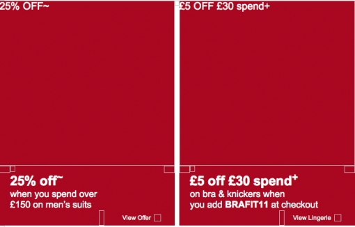
Check out this newsletter! This is how it looks when the pictures are blocked:

Notice that the menu at the top is designed as a text and not as a picture. I can tell you that this isn’t an easy thing to do. It has to match all the email clients and Macs and PC:s. The text must fit inside the frame of every button, regardless of what computer the recipient has. Awesome!
The ALT-texts – i.e. the texts that are visible when the pictures don’t show – are focused on what Mark’s & Spencer’s feel is most important. If a recipient has his/her pictures blocked they get the messages anyhow.

I especially like those small invitations: ”View Offer” or ”View Lingerie” a.s.o. So what M&S does is to encourage the reader to check out the pictures – and thus they increase sales. It’s pretty obvious when you see it, isn’t it?
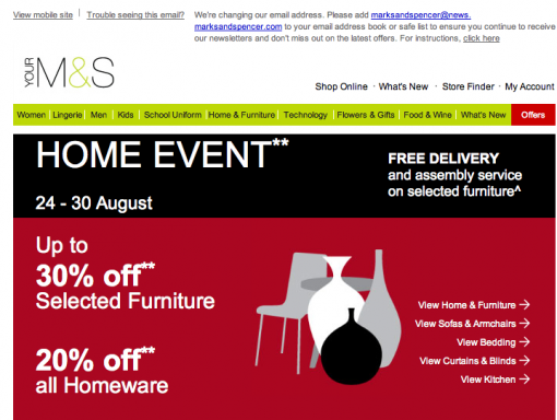
This is how the newsletter looks when the pictures are there. The difference isn’t that huge, is it?

I would like to ask you a favor. I’m going to give some lectures this fall about emailing. Now the question: What would you find interesting to hear about? What content, what issues would you like to learn more about? I would be very happy indeed if you send me an email and tell me. sarah@iloveemail.se
Sarah@@@@@
Monday, 19 September 2011, 10:50 PM
I’m so delighted that Compost attended the Nordic eCommerce Summit in May this year. Their seminars were incredibly popular and I do hope they’ll be with us next year as well. Be there to meet them!
By the way, do you agree on what Robert says here?

Sarah@@@@@
Wednesday, 14 September 2011, 6:20 PM
I’m in Boston at shop.org and I’m doing my best to listen to all the seminars. In general I guess you could say that we in Scandinavia are wrestling with the same problems as the Americans when it comes to email marketing. Most e-retailers don’t experience the same positive figures in opening frequency, clicks, and conversion as we did a few years ago. 95 % of the Americans have their pictures blocked – according to Ryan Urban at Acquisition. Social media seem to have gathered most of the attention here also – and email hasn’t really been regarded as a social medium, although it is really.
Stefan Tornquist started his presentation with a question about how many in the audience wanted to have ”Facebook likes” rather than their customers’ email addresses. I think the answer is pretty self-evident. Of course we prefer their email addresses. I liked that introduction very much; we didn’t have to waste any more time declaring the impending death of emailing. As you can understand the topic of the day is emails and for the very first time in months I think I heard some new things… Well, not that many new things, but still… 😉 Something that we’ve heard a lot here is that emailing is what drives conversion! Everybody really acclaims emailing here.
Here are some points I’ll bring home:
- The header or title of the newsletter should be shorter than we’ve said before. Not more than 30 letters, absolute maximum is 40 letters – blanks included. Quite a few e-mail clients cut off a text longer than approximately 40 letters.
- Convince your customers that your newsletter isn’t spam. You gain trust by using a well known sender name in combination with telling why you make this contact.
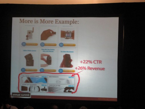
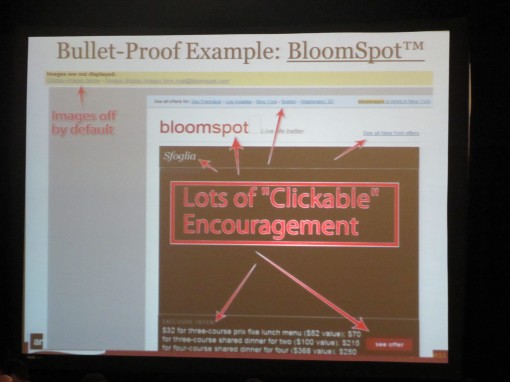
- Work with bottom navigation. Often you might send a newsletter containing products that aren’t interesting for all your customers, but maybe they want to visit your site to check on something else. So make it easier for them! Bottom navigation often results in an increased revenue. Do consider all navigation in your letters. Bloomspot is a good example to show that where there are pictures with Alt-text, the traffic is most intense.

- In A/B tests there havn’t been one single example showing that the longer letter looses in any way compared to shorter ones. Interesting, isn’t it? So, long letters are something you can use. But the readers behave as they were reading a list if the letters are long. They read the first parts and the last ones. Something to remember!
- When it comes to design and structure of a newsletter we often look at bigger companies. Don’t do that any more! Because the big companies are often the ones that handle blocked pictures in the least effective way. Amazon and Walmart don’t have Alt-texts that tell people to download the pictures, for instance. You should always add a link ”Check our offer” or ”Read the letter with pictures” in the mail itself in order to enhance the chances of the readers downloading the pictures. We looked at 3 examples: AppSumo, Bloomspot, and Groupon:


- One way of collecting email addresses is to use a neat pop-up window when the visitors are visiting for the very first time. Ask them for their email address and offer them something in return. In this way you can also send them: 1. An abandoned cart-email, 2. An abandoned site-email. See? The Americans know how to sell. 😉
- Follow the subscribers when on your site. Where did they leave? On the landing page? What can you do to make them buy? Email subscribers are generally spending more time on your site than ordinary traffic.
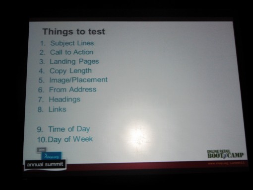
- Make tests of one thing at a time and do it in the right order. Here is an example of an order in which you can test various things:

This is a little sample of what we’re talking and hearing about here in Boston. Now I’m off to next seminar. (Just one more thing: I do like to be a princess again! Some time ago it wasn’t so cool to say that you were working with newsletters. The thing to be doing was about social media – then you were the princess. But see, now I’m back! How I love Boston!)
Page 7 of 25« First«...56789...20...»Last »
