Monday, 9 July 2012, 5:56 PM
Some time ago Campaign Monitor, an e-mail service provider, got in touch with us asking why they didn’t get the best mark in our test of e-mail tools. One of the reasons was that we felt that guiding films and other types of support are really important for a user who really wants to master the tool.
Their answer was that they would look into the matter at once. (I do like that kind of attitude!) And the founder of the company, Ben Richardson, seems to be a man of action. When you visit their home page you’re immediately encountering this very nice ”guiding” film clip on their editor. Since I’m a girl having a weakness for synth music – I kind of fell in love with it…
Campaign Monitor Editor Demo from Campaign Monitor on Vimeo.
Ben, if you read this … Where’s your very nice e-mail gallery? I miss it, can’t find it on your new fine home page.
Love Sarah@@@@@
Saturday, 7 July 2012, 8:24 PM
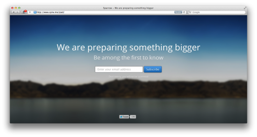
Here’s a neat example of how to get e-mail addresses for a certain purpose or for a specific campaign. In this case it’s the e-mail client Sparrow for iPad that is being marketed.
At first they entice you to register by not telling exactly what it’s about. But you will be among the first ones to be informed. Note that they write: ”Don´t worry, you will not be spammed”, just to ensure you that they take care about your e-mail address.

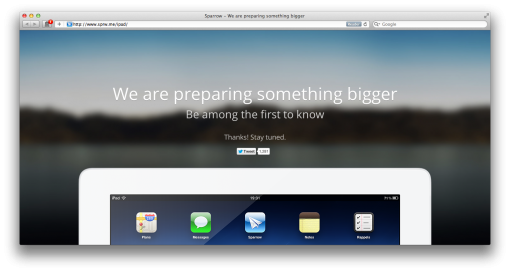
When you have registered, an iPad with an app appears – revealing something you really already knew.

Such a campaign is great fun, I think, it’s simple to implement, it’s cheap and it´s personal – ‘cause our e-mail address is still among the most personal things we have on the Internet.
Maybe something you should try?
Saturday, 30 June 2012, 8:27 PM
Have you also noticed that some newsletters, especially those not coming from Sweden, start with [MARKETING] in the headline? Twice I´ve been asked about it, so I decided to put the question to MailChimp and Campaign Monitor. Their e-mail tools are used worldwide and they are very obliging when it comes to answering questions.
The reasons why some newsletters use this ”sign” in the headline are these:
- In some regions, especially in the US, it´s either according to the law or is considered to be best practice – even appropriate – to use a prefix in the subject line.
- In China, for example, there is a law stating that you must write [ADV] in the subject line when it´s a question of marketing or advertising in the newsletter.
- In the US this ”sign” must mark any letter with an ”adult” content.
So should we start the headlines of our Scandinavian newsletters with [MARKETING] when they contain marketing? My personal stand point is: No. On the other hand I do think that we should be clear about informing our readers about the expected content – when they register. Why not let them read older newsletters as examples? And do tell them how often they can expect a newsletter from you.
I´ll soon be back and tell you my views on one vs. many letters. That will be a long post!
Wednesday, 20 June 2012, 11:18 PM
This e-mail message has been sent to info@iloveemail.se in accordance to the rules for e-mail marketing in the Data & Marketing legislation in Europe.
This is what is said in quite a few of the newsletters from Swedish companies and these newsletters frequently land into our info addresses. Those are letters we do not want.
It´s a great pity that Swedish companies choose to send this type of uncommissioned newsletters. Why don´t they wish to communicate and create relations with their customers? Why do they use a legislation from the European Union as an excuse to avoid a marketing opportunity?
Please do NOT answer this message, since it is sent from an e-mail address that is not monitored.
This is usually written close to the unregistration link. Obviously they do not want to take responsibility for their marketing since the company makes it difficult for the customer to get in touch with them. Do send all your messages from an e-mail address that is available.
This newsletter is being sent to you since you are registered in our data base.
Why are people´s names in your data base? Avoid buying data bases with e-mail addresses! It will be very evident that you don´t really care about your customer registers if you do.
Enough of bad examples. Here is one worthy of imitation. It´s from Kjell & Company.
You receive this newsletter because you are a customer of ours, you have ordered a catalogue from us or you have registered for newsletters from us (read more). If you would like to unregister, it´s really easy, just click here. We would be happy to receive your view on this e-mail or on our products. Please send a message to kundtjänst@kjell.com.
Monday, 16 April 2012, 2:27 PM
I feel it’s really interesting that an increasingly number of people choose to develop an attractive bottom navigation bar. When I visited shop.org in Boston there were representatives for ever so many companies telling about how sales in the bottom navigation bar increased immensely. Especially from smart phones. It is as the recipients quickly scroll through the newsletter and when they don’t find anything particularly interesting they seem to appreciate some kind of clear categories at the bottom of the newsletter. Most companies telling about this estimated the sales from the bottom navigation bar to 30-40 % of the sales from the newsletter. Check these examples:

Carter’s has three clear boxes which makes it easier for the readers to go on and to shop. It’s really simple to continue from a smart phone also. The link texts aren’t too small either. Good!

OshKosh B’gosh has the same type of clear ”call-to-actions”. Why does it work so well to ”order” people what to do? Maybe because we feel that it’s nice to hear someone telling us what to do in the stream of confusing(?) information we get every day. (At least that is what I was told at a webinar about Pinterest two weeks ago.)

American Eagle Outfitters has a more ”timid” design, but with the same function.

Marks & Spencer has extremely clear ”invitations”, simple to click on in small entities. In addition they make me feel a little special since the offers only exist online. There is a value in being a subscriber of their newsletter.

And don’t forget to check what it looks like when the pictures are blocked and do tell what your customers are supposed to do in your alt-texts. Make a test – I believe that you’ll have more clicks than you think.

Page 2 of 25«12345...1020...»Last »


